I don’t just create for brands. I’m intentional about what I align myself with & I treat your photo session and vendible products like it. If I photograph it, it means something. My name is on the work just as much as yours and that matters - so if my name is attached to it, it’s because I trust it, fully. Ethics are everything to me and I don’t take on brands I can’t stand behind. I refuse to endorse products I haven’t personally tried or experienced. I won’t work on a project or touch a situation I don’t believe in because when it’s right, you just feel it.
MAKE THEM
LOOK TWICE
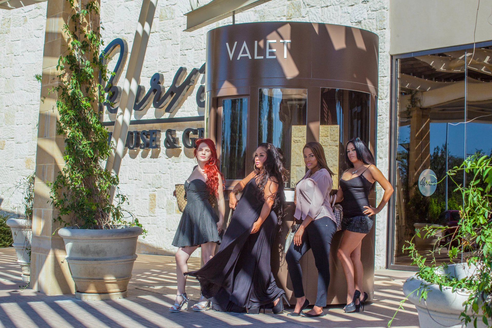
COMMERCIAL PHOTOGRAPHY CONTENT
+ PRESENCE-DRIVEN PROMOTIONAL IMAGERY
IT'S ABOUT
EXPERIENCE.
From gloss-drenched beauty and soul-soothing wellness to rebellious canna and barrel-aged, slow-burning whiskey, ritual-driven skincare and precision-led science, runway-ready fashion, experience-first hospitality, flavor-forward food and beverage, body-honoring fitness, future-facing tech, statement-making jewelry, and across industries, times are changing. Brands are stepping into new versions of themselves. They are refining what they offer and rethinking how it’s experienced at first glance. They are noticing how it lands, how it lingers, how it’s remembered. This is more than a shift in marketing trends; it’s a shift in how brands exist in the world. Less static. More dimensional. More human. And this shift is more needed than ever before!
Traditionally, commercial photography was simple : clean, clear, and product-forward. Its job was to show exactly what something looked like so people could decide whether or not to buy it. White backgrounds. Even lighting. Minimal distraction. It was informative. Functional. Straight to the point. And for a long time, that worked. But people have changed and the way we connect has changed with it. You can’t fake presence anymore and the audience can feel the difference. The shift isn’t subtle : you can feel it in what holds your attention and what doesn’t. People aren’t just looking anymore, they’re sensing. Reading between the lines. Feeling what’s real and what’s not. This isn’t strategy - it’s meaning making a comeback. This isn’t a trend; it’s truth pushing its way back to the surface.
MEANING REFUSES TO BE IGNORED ANY LONGER FOR CHEAP, STEREOTYPICAL CONSUMERISM.
IT'S ALL RELATIVE.
Now, commercial and promotional photography live somewhere much more layered. It’s no longer just about visibility and your product being seen to be desired. It’s about resonance. Products aren’t just shown; they’re placed within a feeling, a moment, a lifestyle. The image isn’t just answering “What is this?” It’s quietly asking “What would it feel like to have this in your life?” How could your brand change and shape this person’s life?
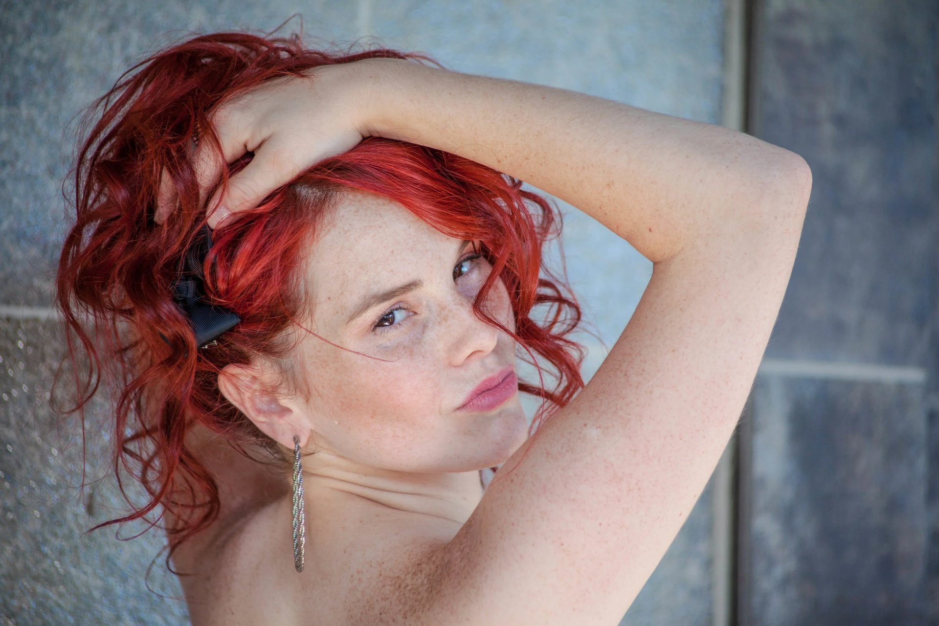
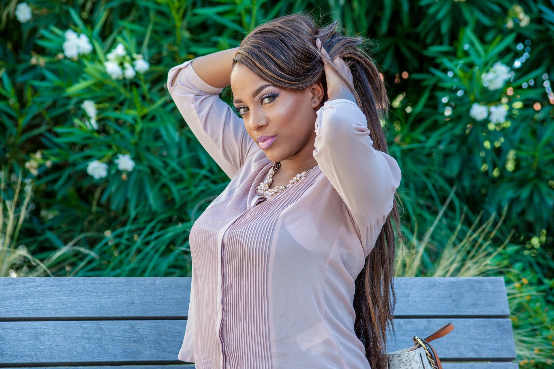
That’s where the shift happened. Promotional photography brings in narrative. It introduces a drive to be more than just a seller. It allows you to show free-spirited ambition and controlled goal setting, a certain lively get-up-and-go energy, and intentional improvising. It gives context to the product : who it belongs to, how it’s used, why it matters. And when you introduce a face into that space whether it’s the founder, the maker, or the person the product was designed for, you create something people can anchor to. Because a face changes everything and makes the name mean something.
It adds trust. It adds relatability. It adds proof that there’s something real behind what’s being offered. Some real emotion or use, something less sterile and more raw, more unconstrained, more unrestrained, more free. In this day and age, we are all searching for that ever elusive freedom and now, the product isn’t floating in the air, in cyberspace or in a magazine, it’s grounded, it’s tangible, it’s accessible. It exists in someone’s hands, in someone’s life, in someone’s story. And that story becomes the entry point. Instead of selling an object, you’re offering a glimpse into an experience. Instead of asking people to understand, you’re allowing them to recognize.
PEOPLE DO NOT CONNECT TO PRODUCTS - THEY CONNECT TO PRESENCE, TEXTURE, MOOD, & MEANING.
MAKE IT MODERN.
This is what modern commercial photography has become : The perfect blend of clarity & connection. Of information & emotion. A way to show what something is, while simultaneously letting people feel why it matters. Because at the end of the day, people don’t just want to see what you’ve made. They want to know where they fit into it.
LET ME GIVE YOU AN EXAMPLE.
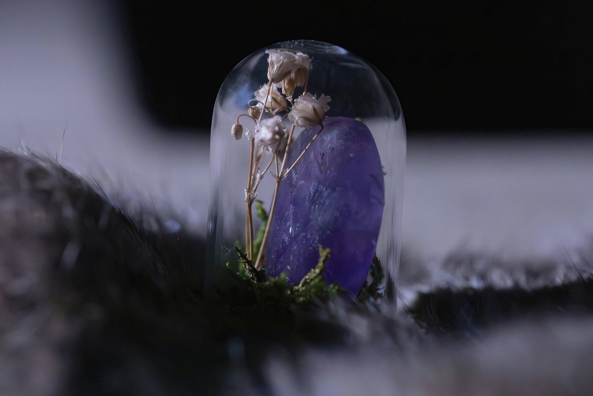
Ancient Mystic’s Metaphysical goods, gifts, & oddities feel like stepping into something dimly lit, a little dark academia-esque, and purposely deliberate; everything owner and resident witchy woman Aryanna creates pulls from a deeper level of existence where the supernatural meets the physically present in corporeal form. What sets her apart from your average crystal and alchemical atriums is her belief that the cardinal signs more than notions or directions.
METAPHYSICAL COMMODITIES + ODDITIES
ANCIENT
MYSTIC
Her creations are yielded with bits of glamour magic and everything Ary cultivates has emotional depth, hallowed weight, vibrant color, rich texture, and a reason for being there. The brand carries a distinctly earthy and gothic energy - organic, a little moody, a little untamed. Nothing about it feels mass-produced or detached. It feels gathered. Chosen. Built from instinct rather than aesthetics alone, each piece feels dwelled in and haunted by a familiar and altruistic kindred spirit.
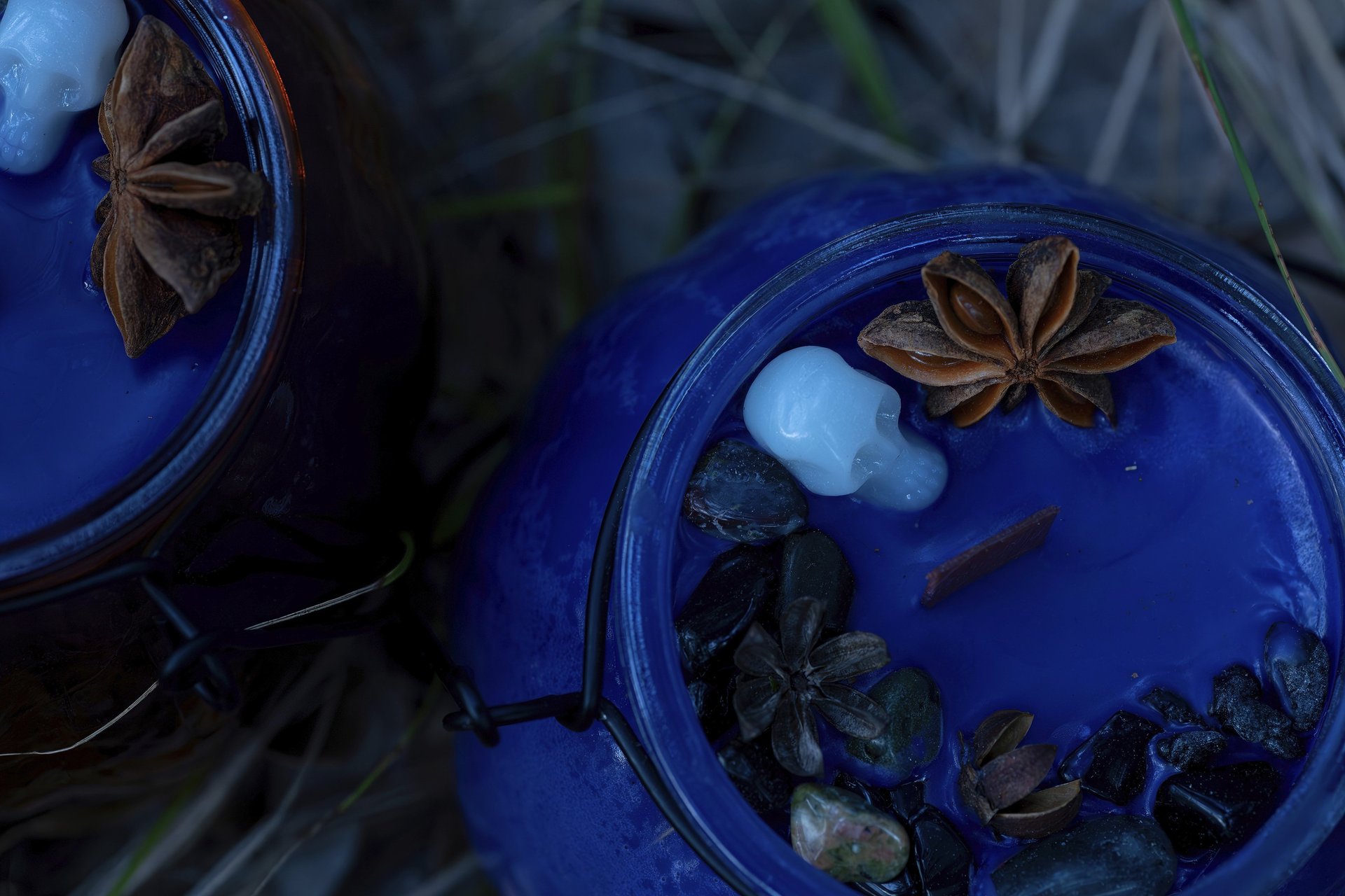
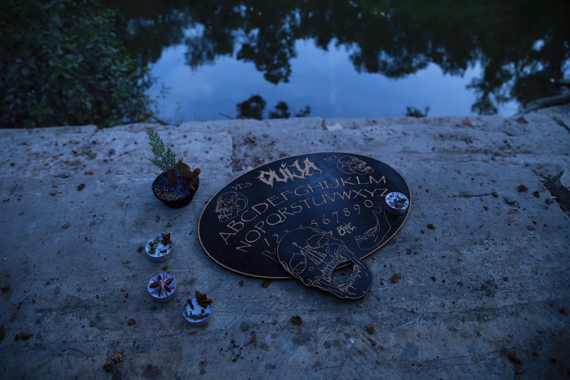
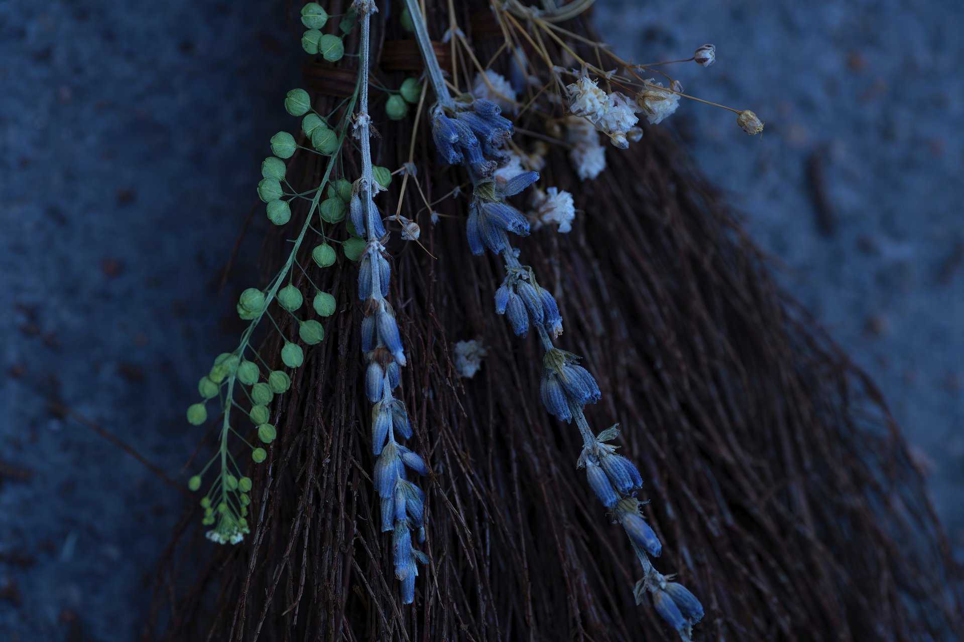
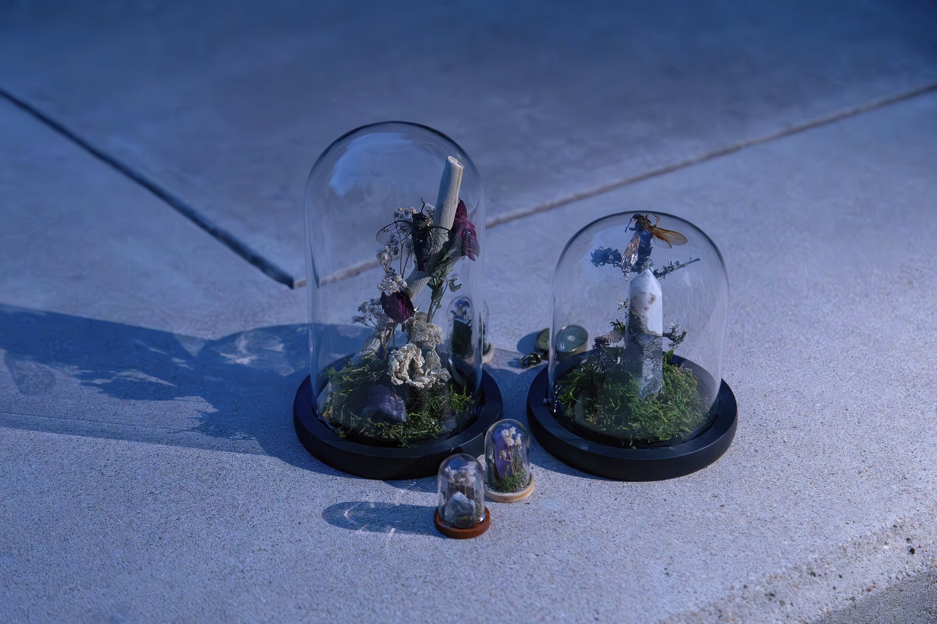
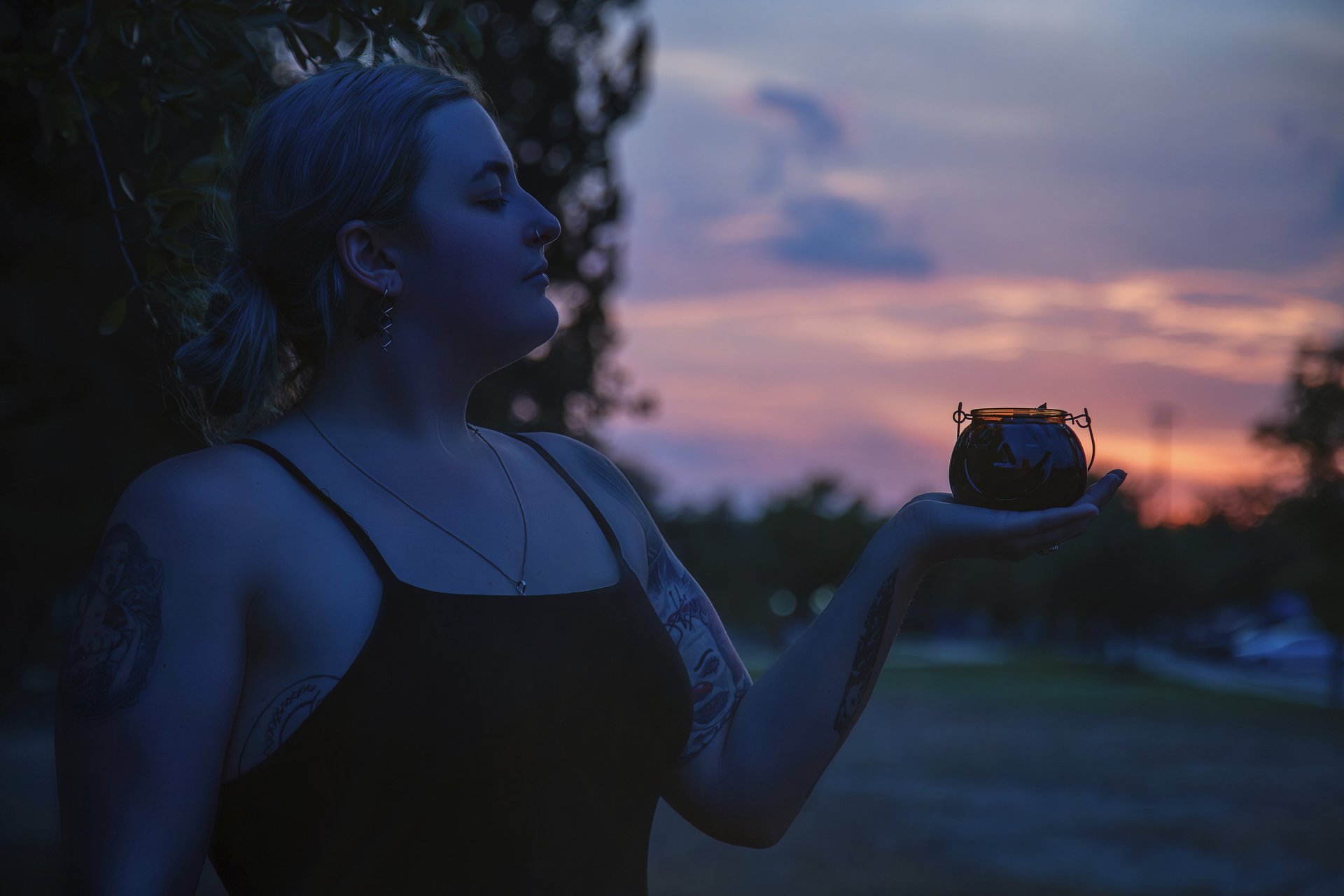
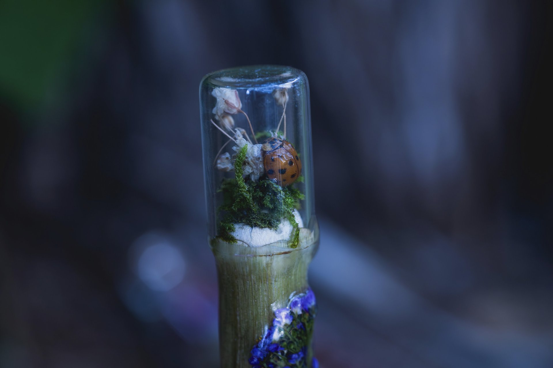
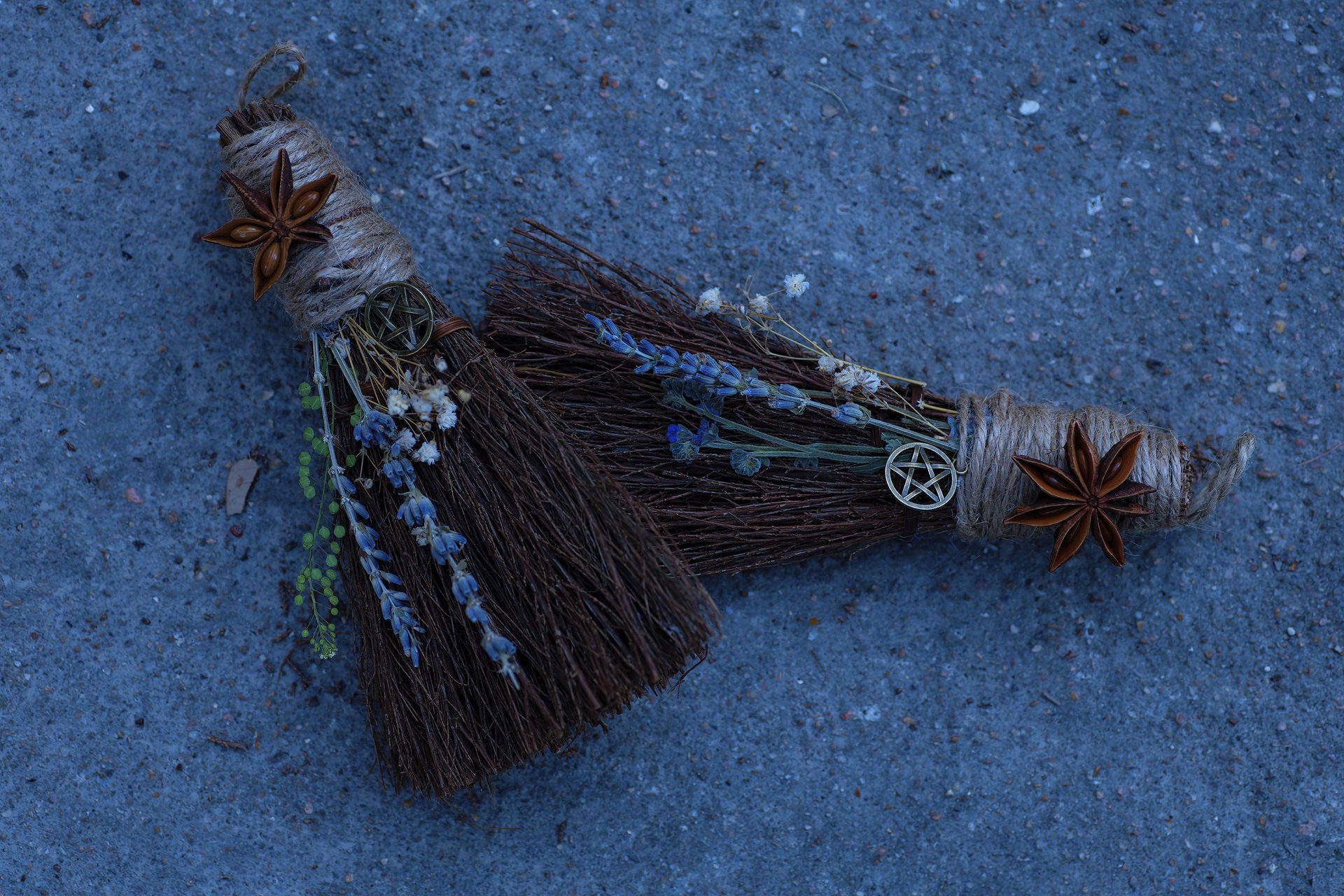
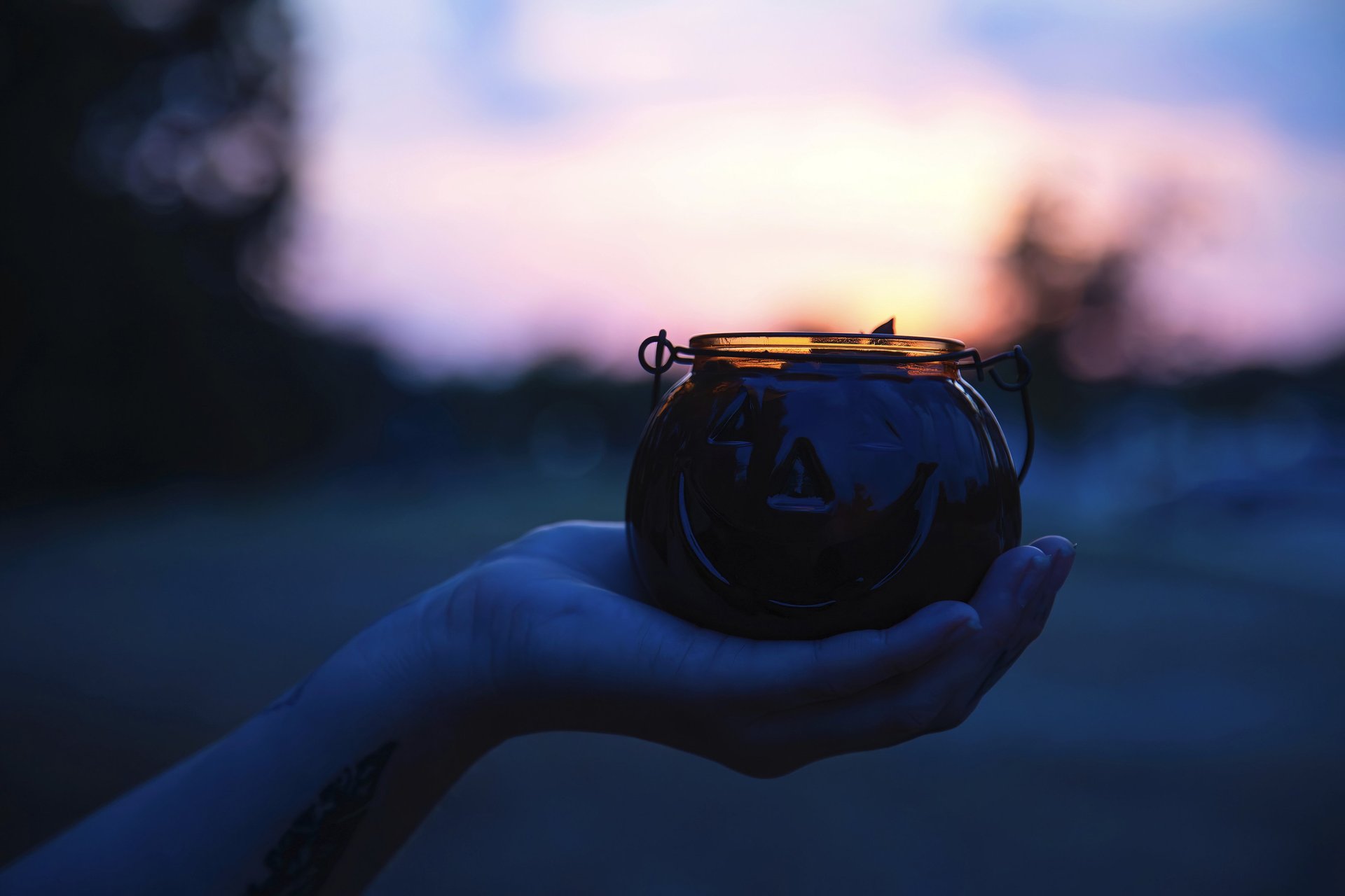
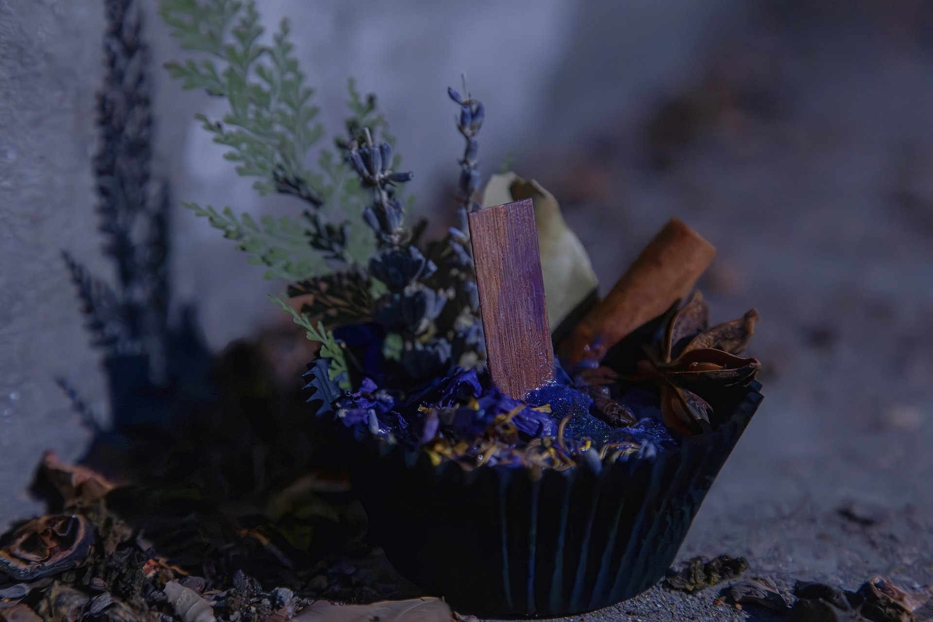
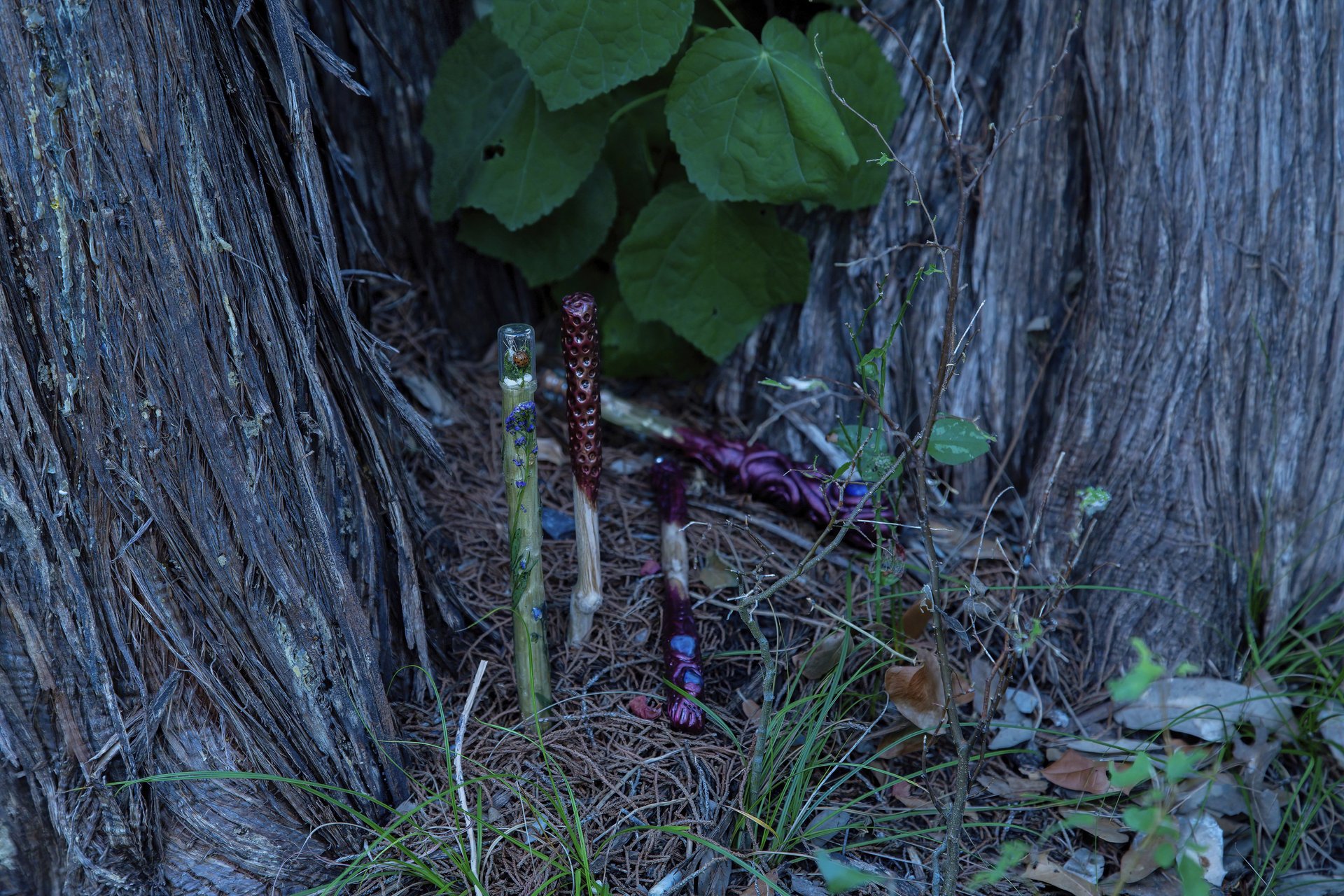

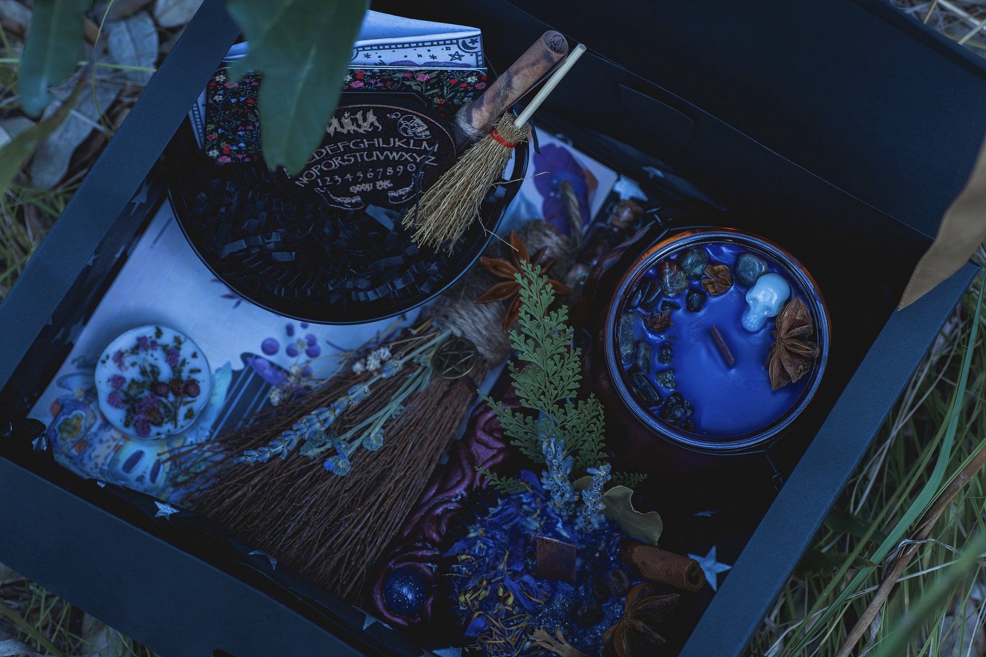
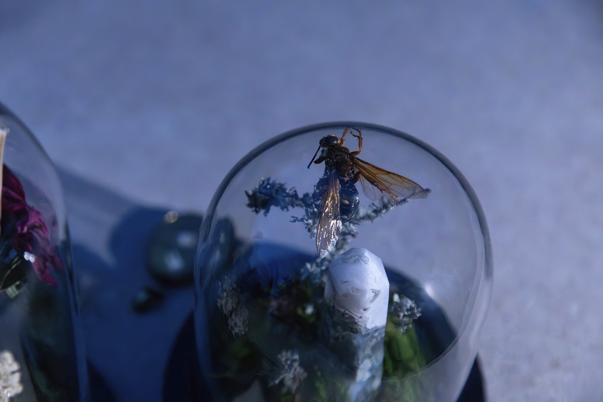
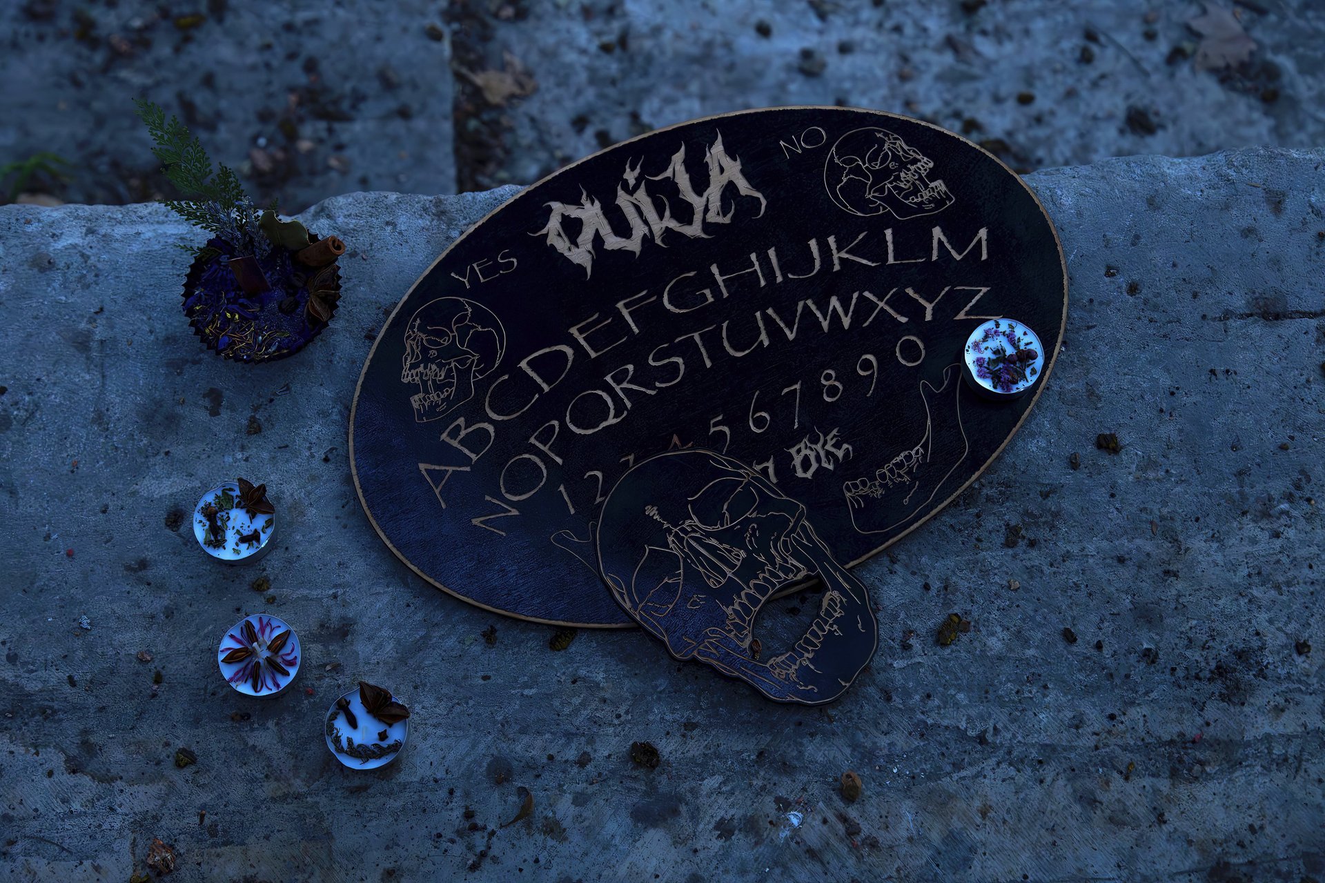
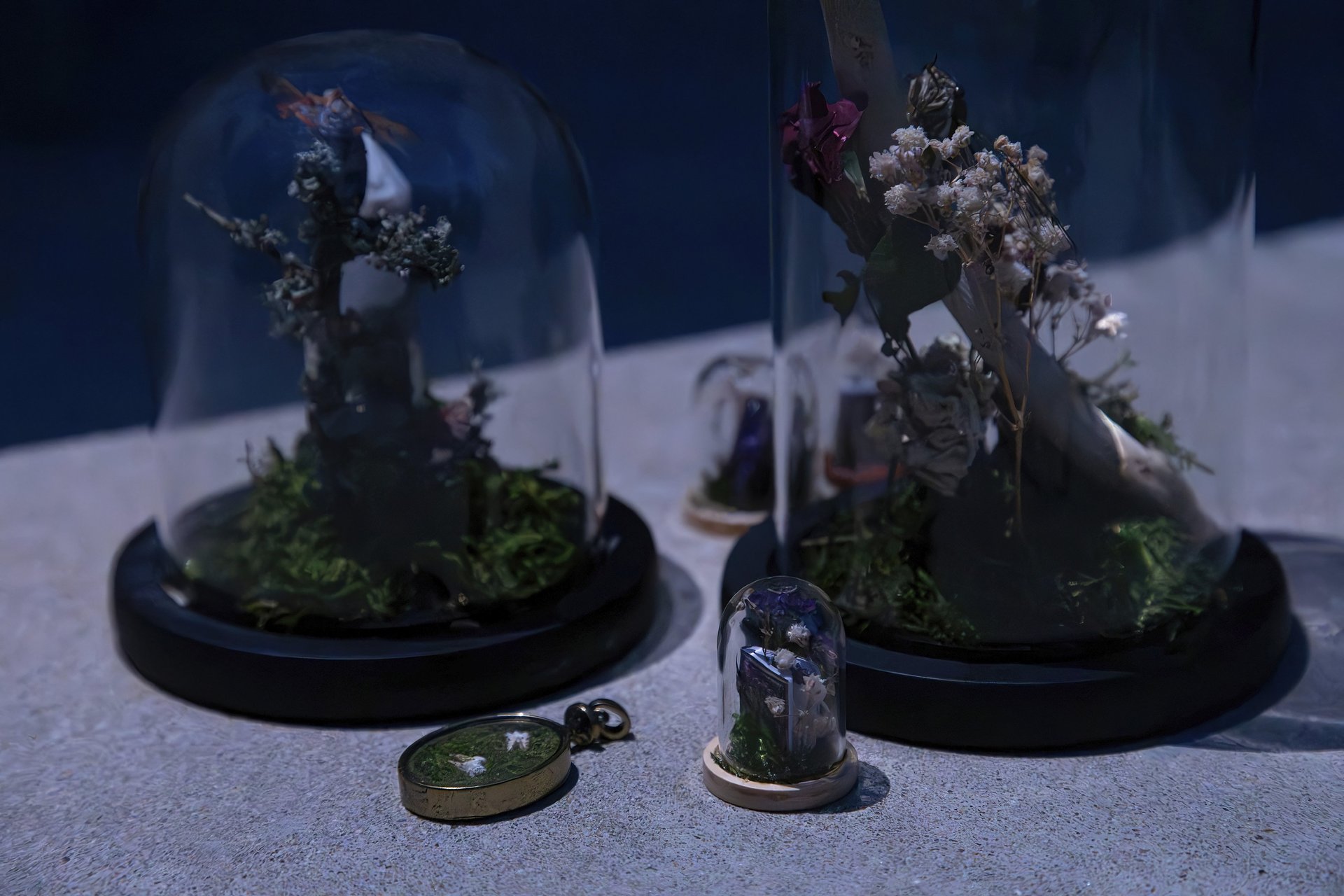
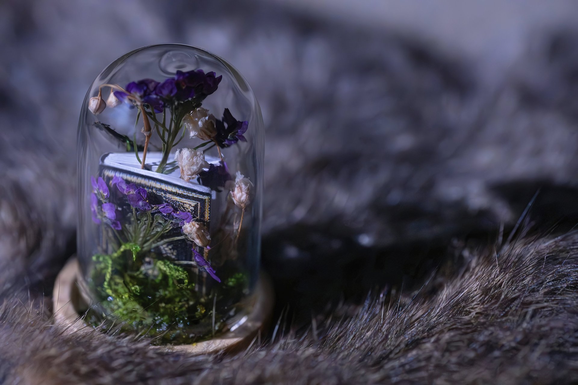
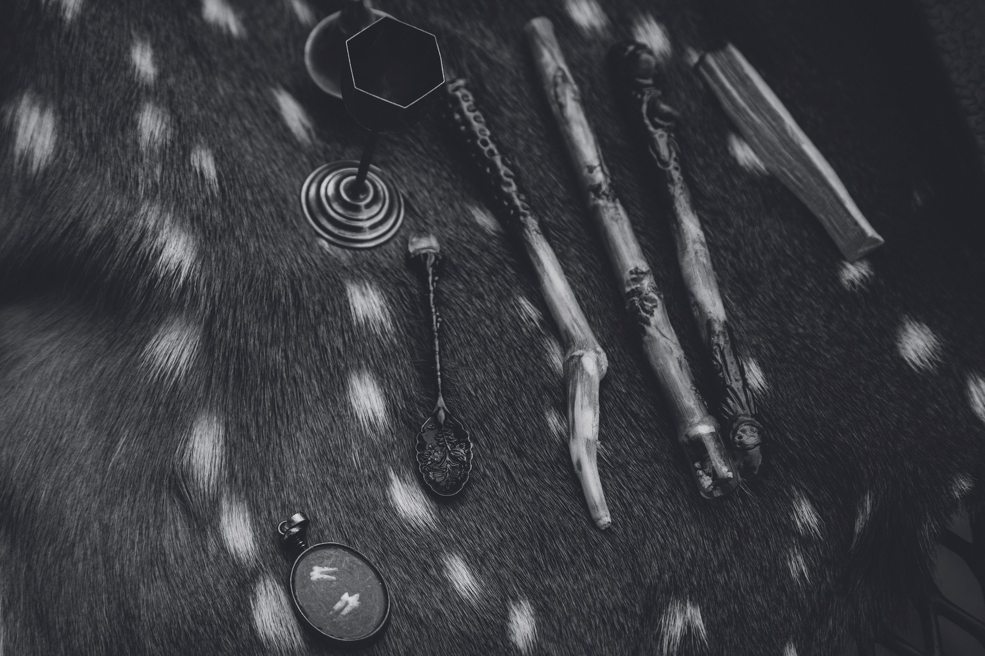
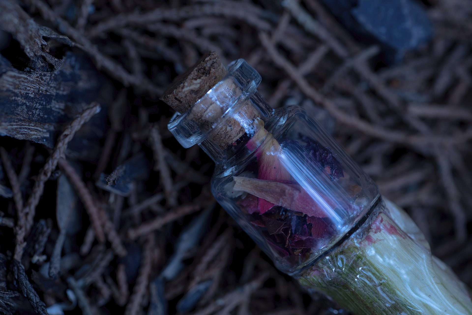
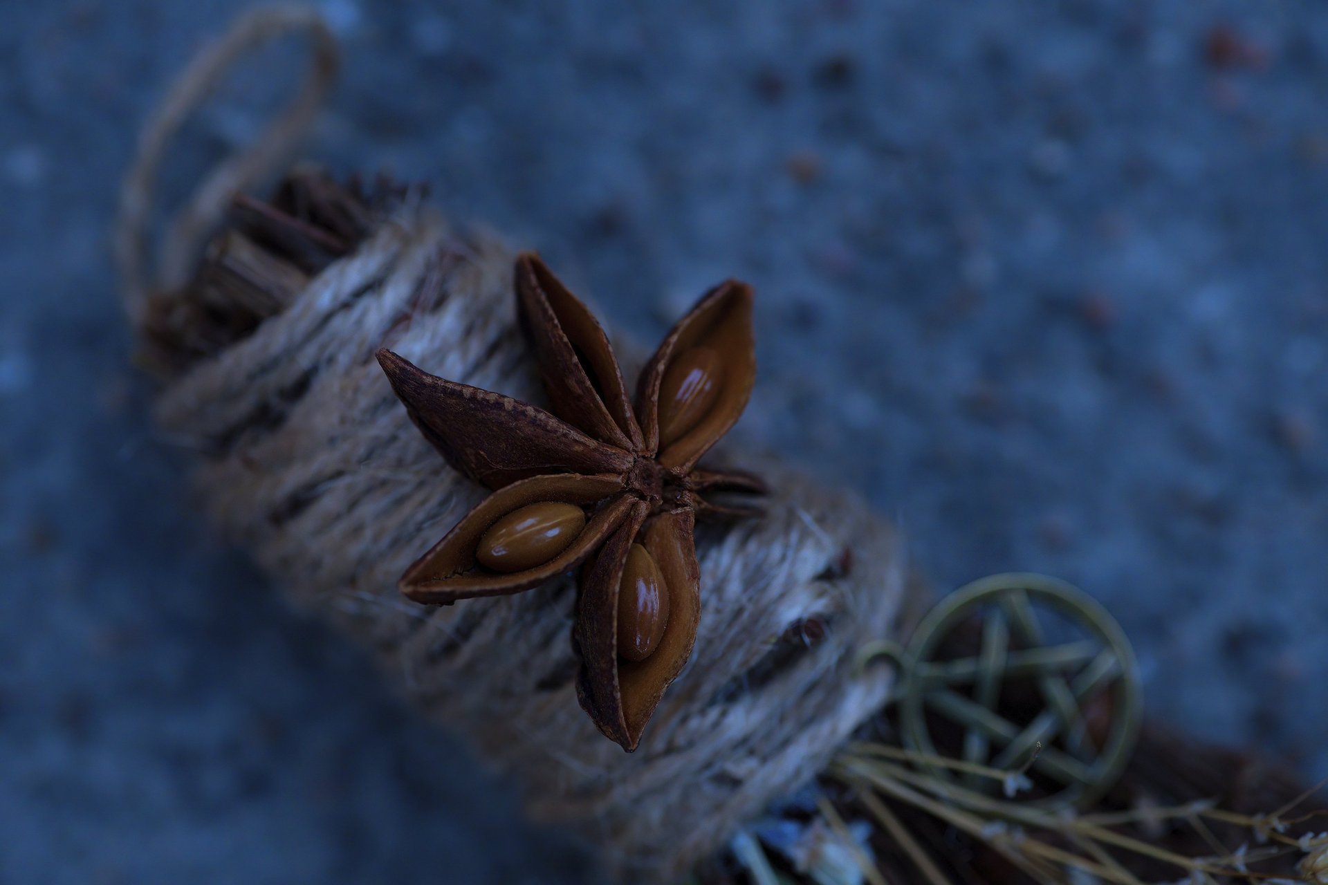
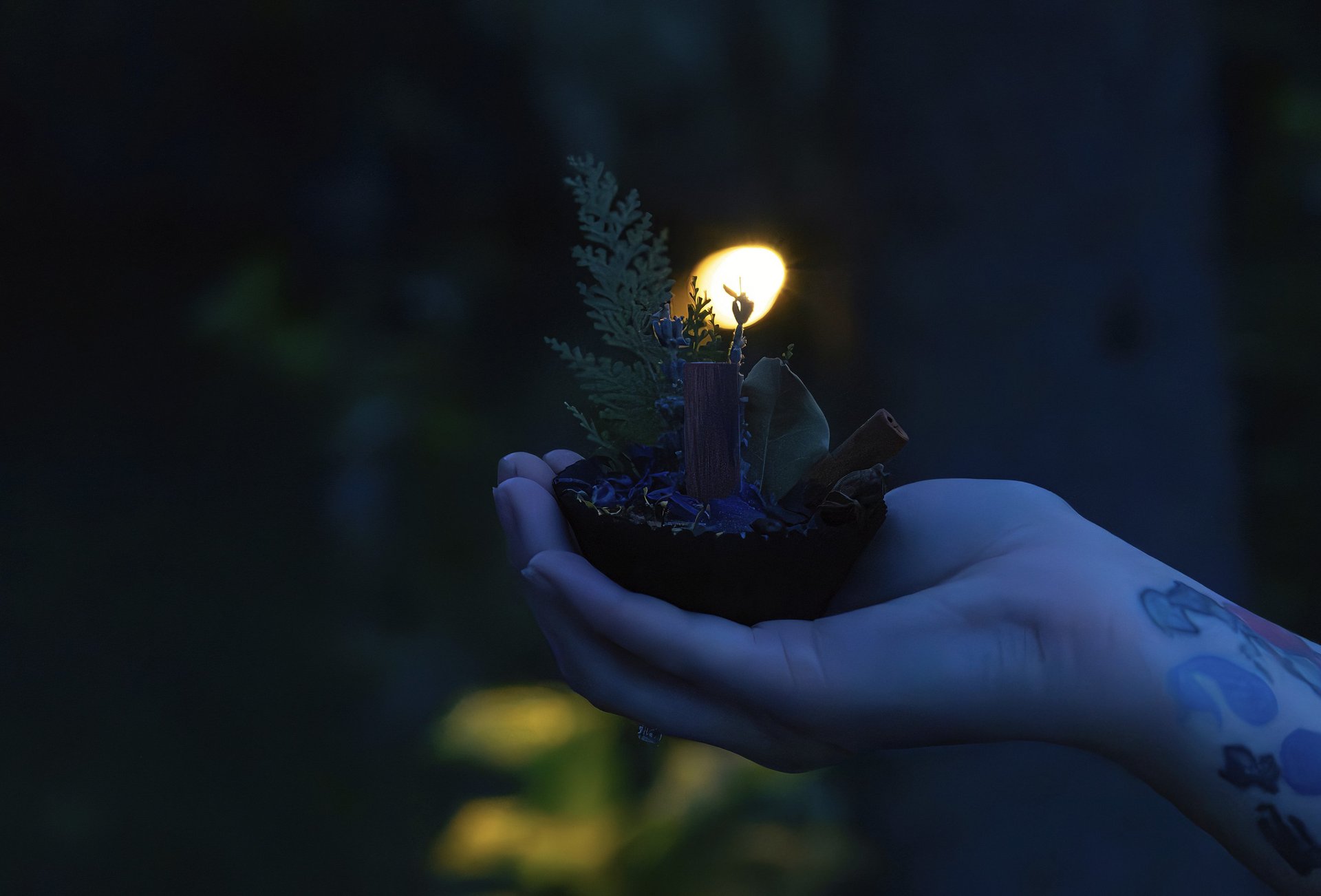
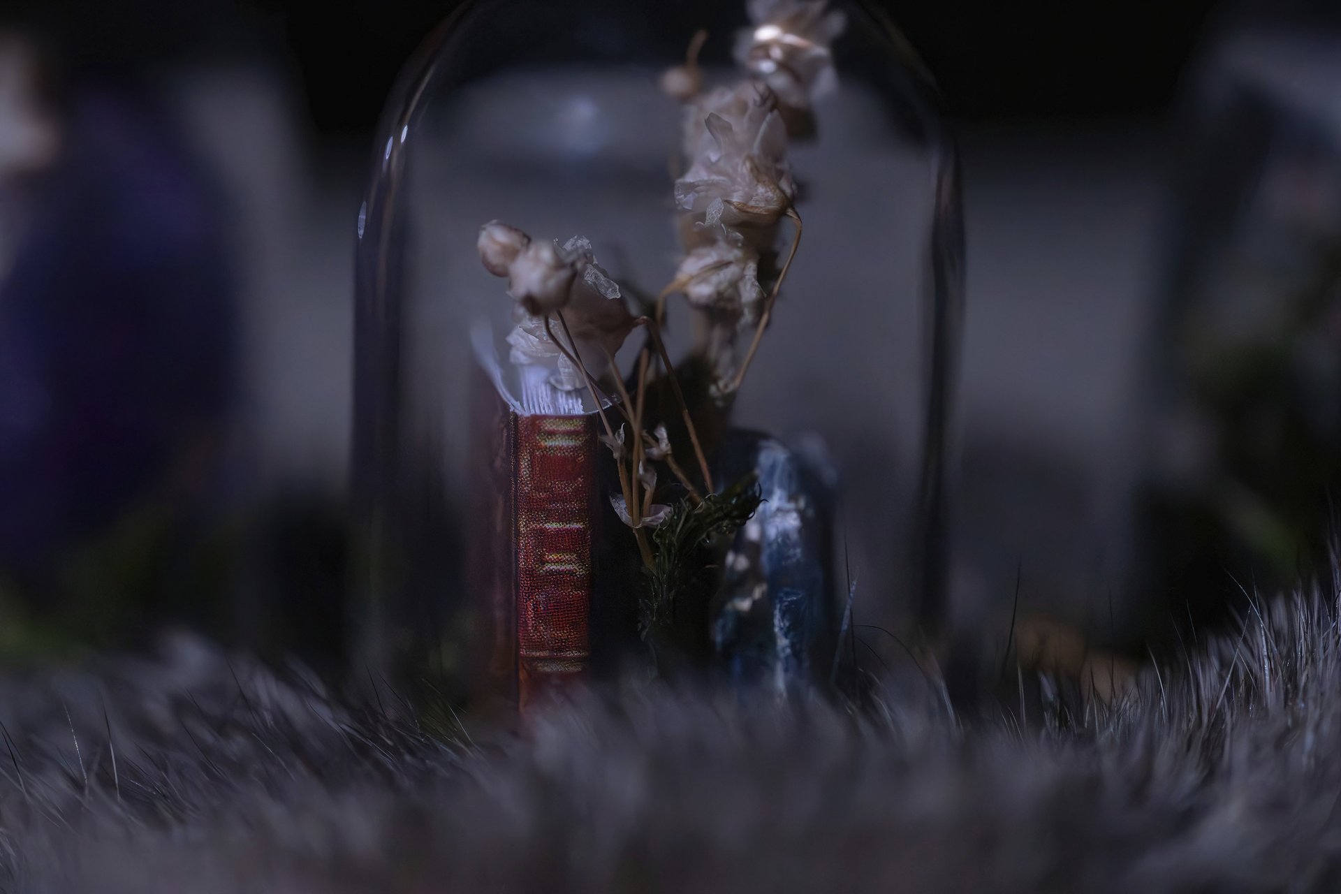
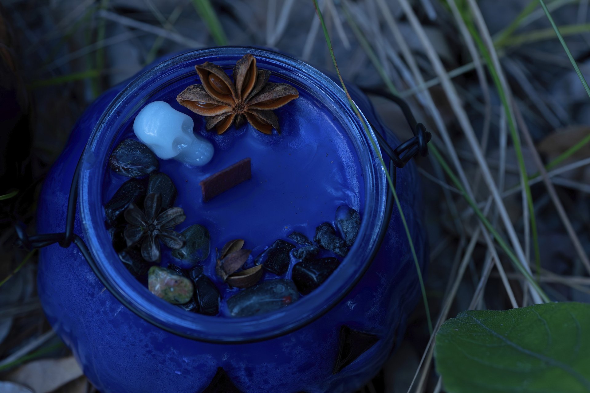
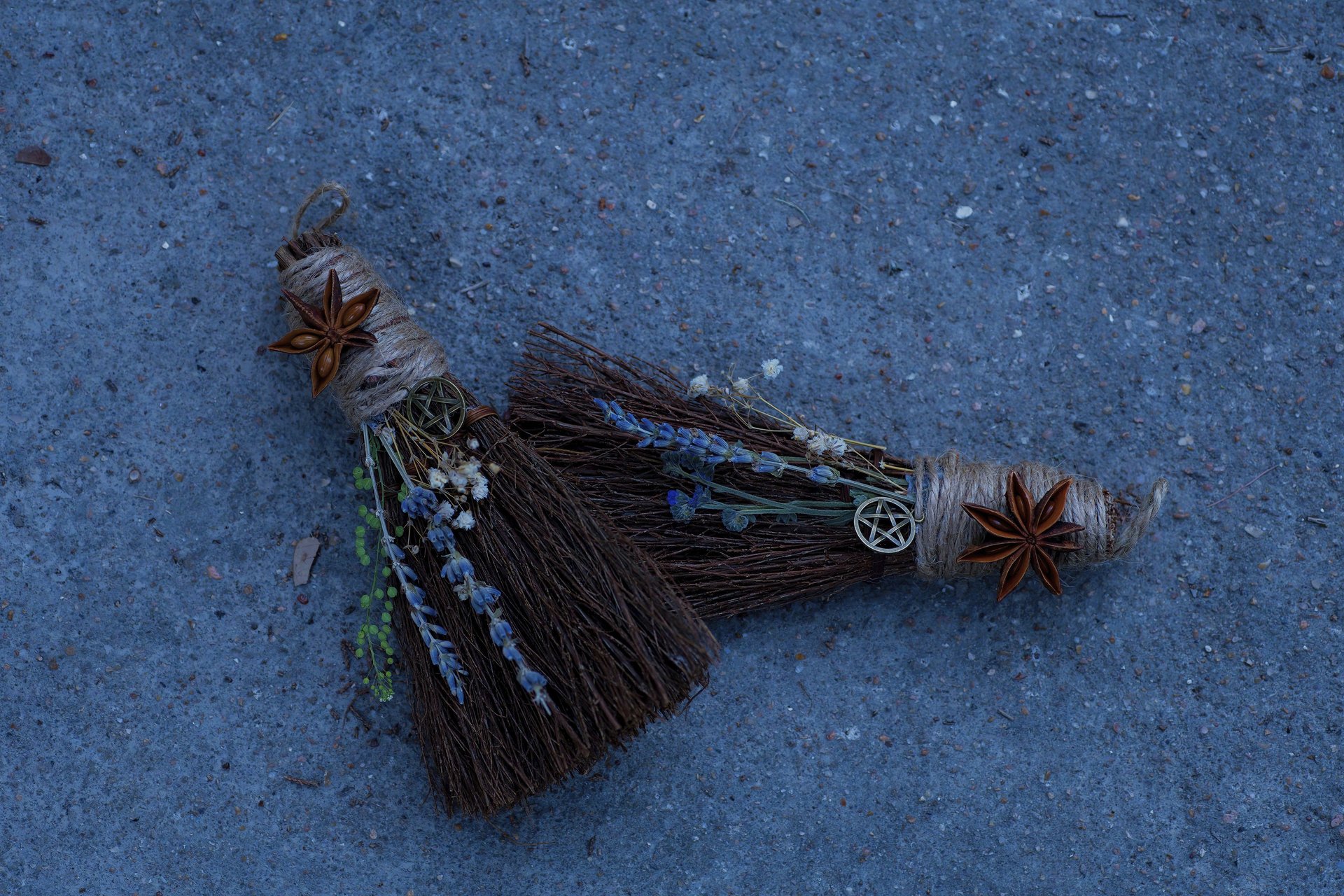
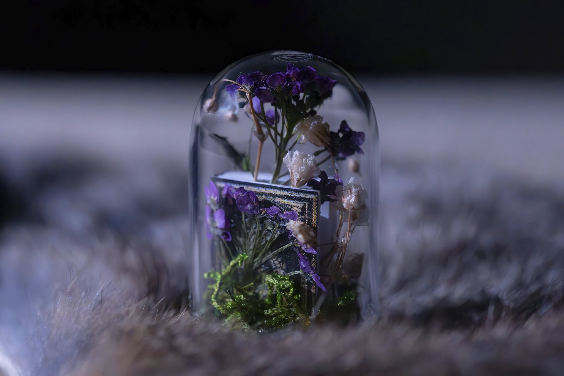

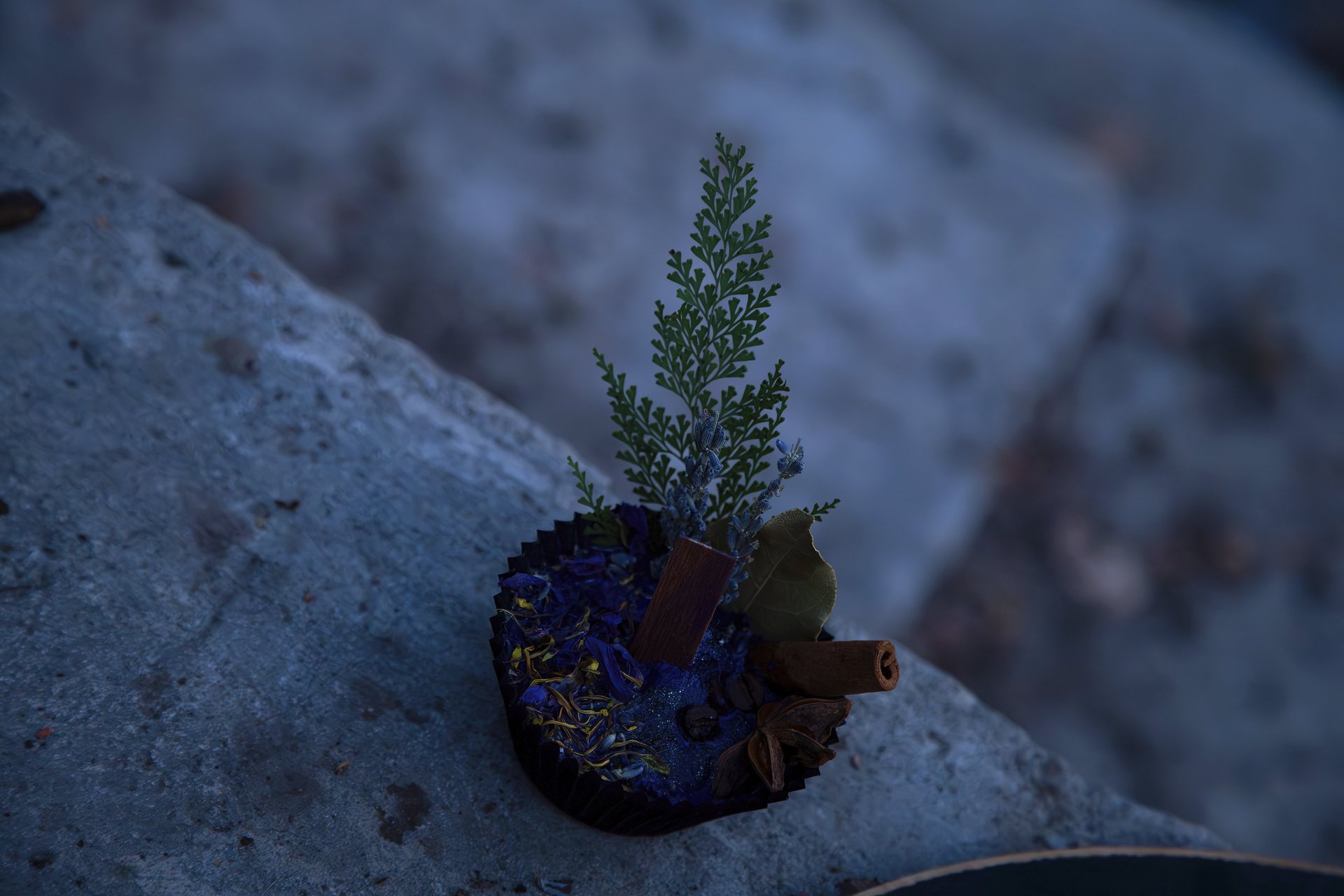
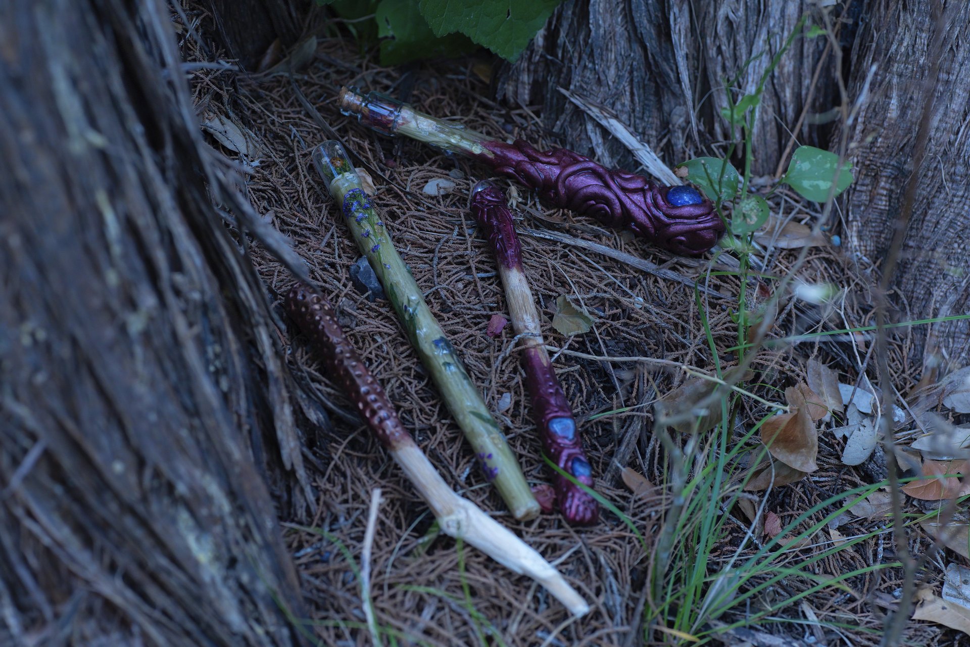
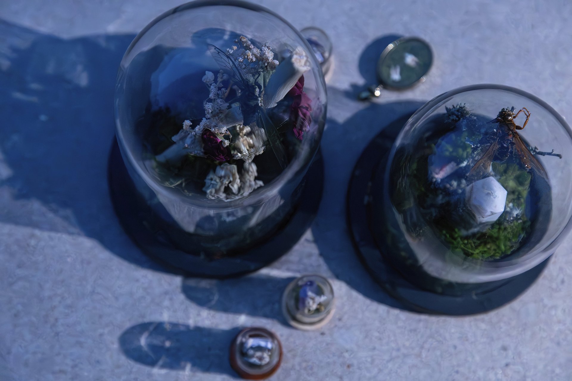
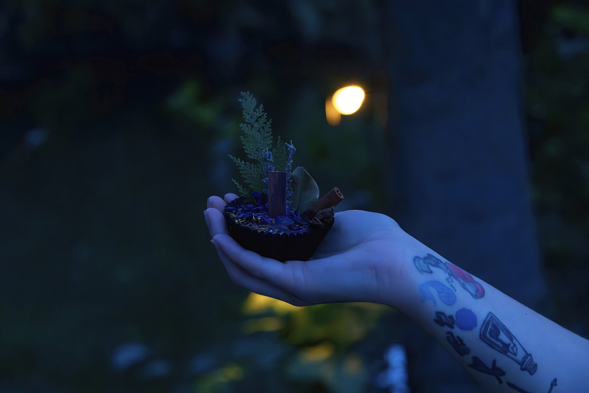
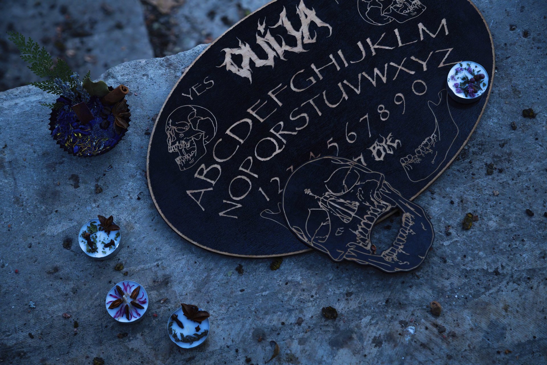
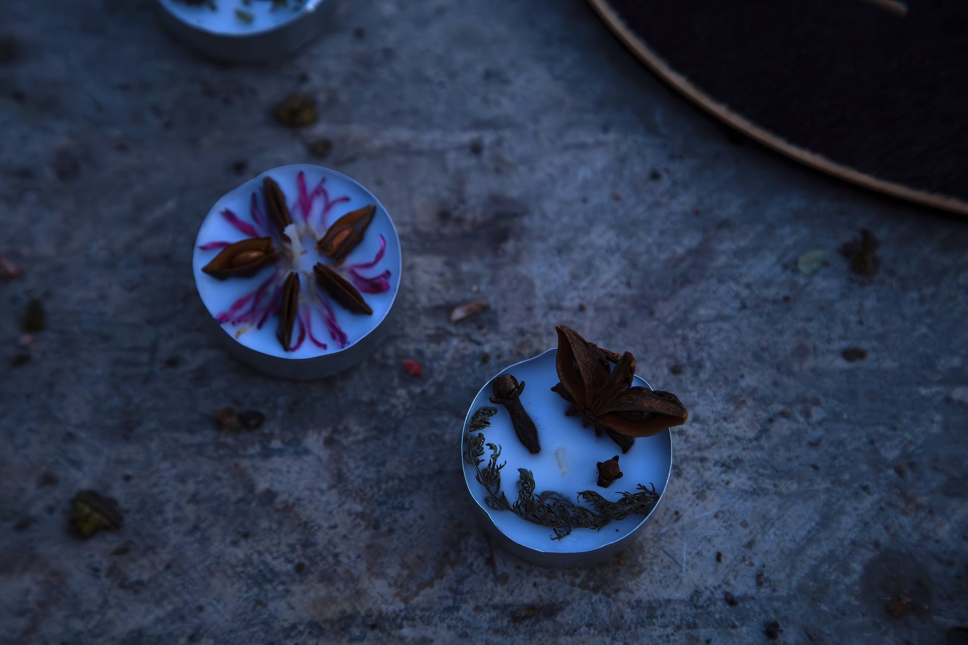
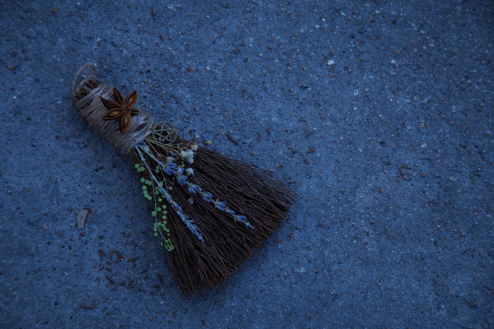
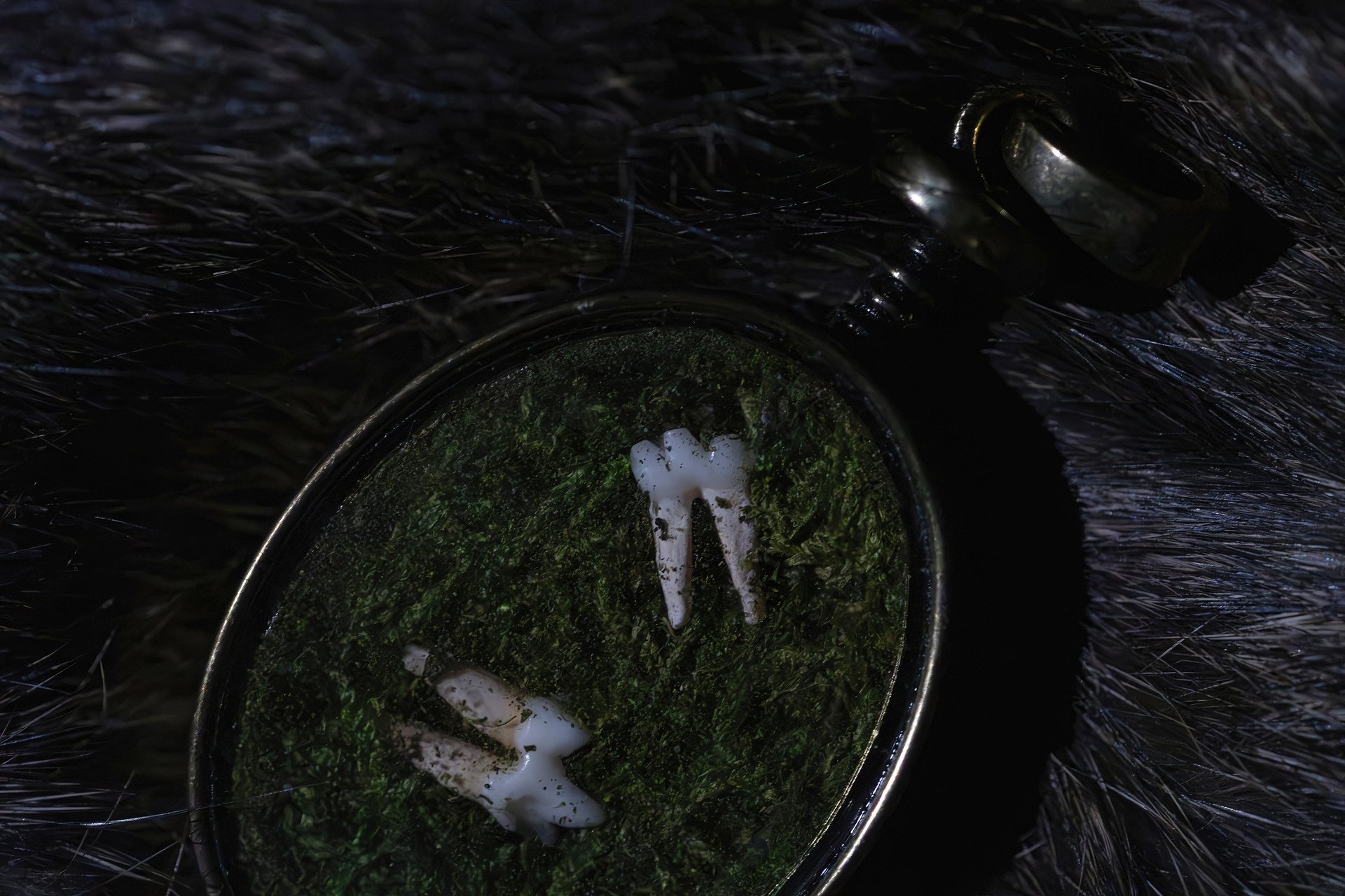
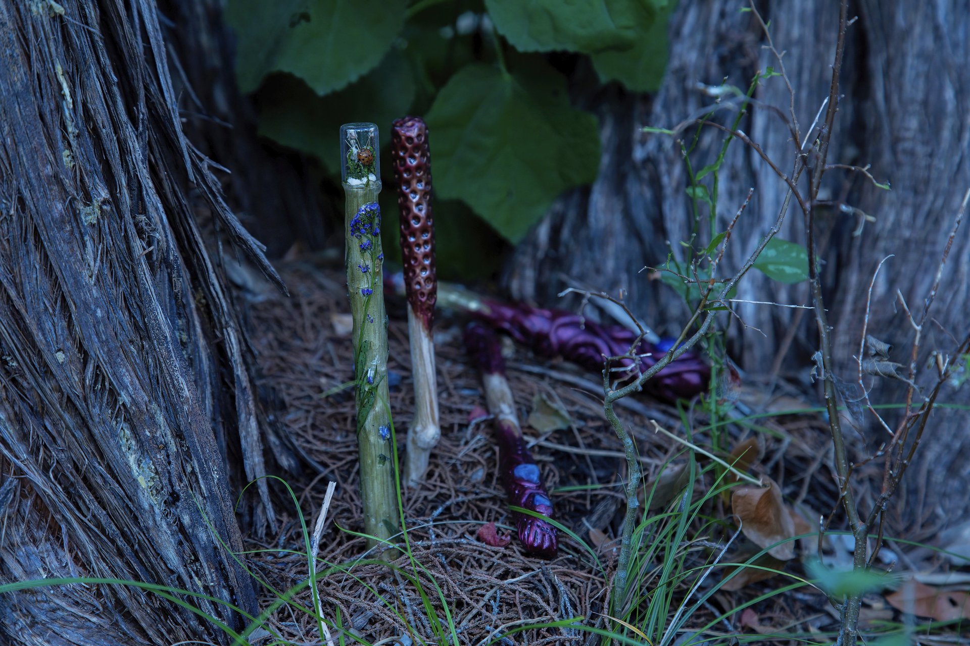
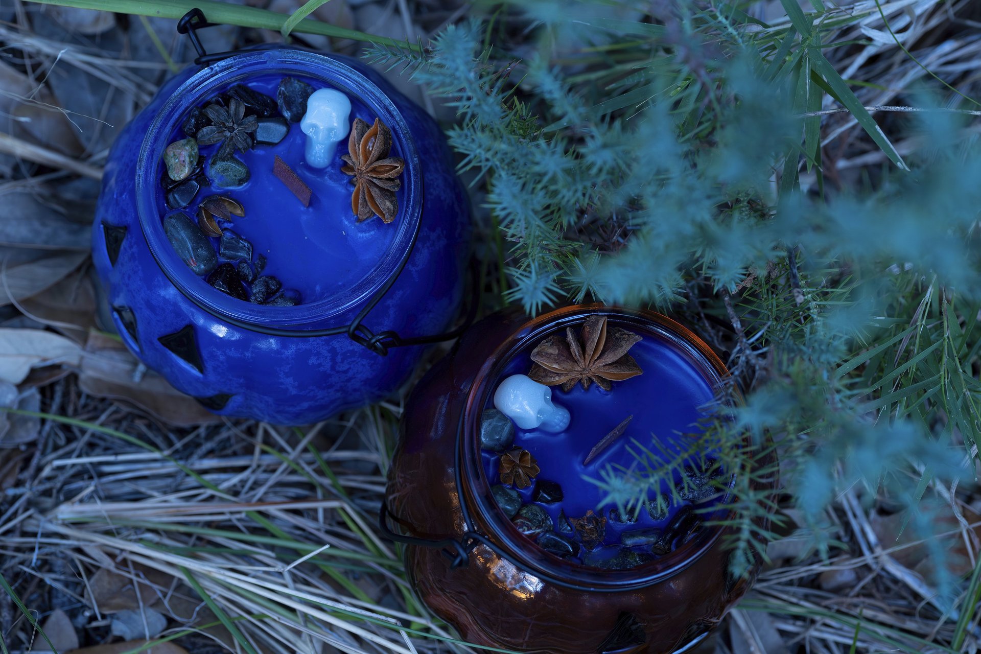
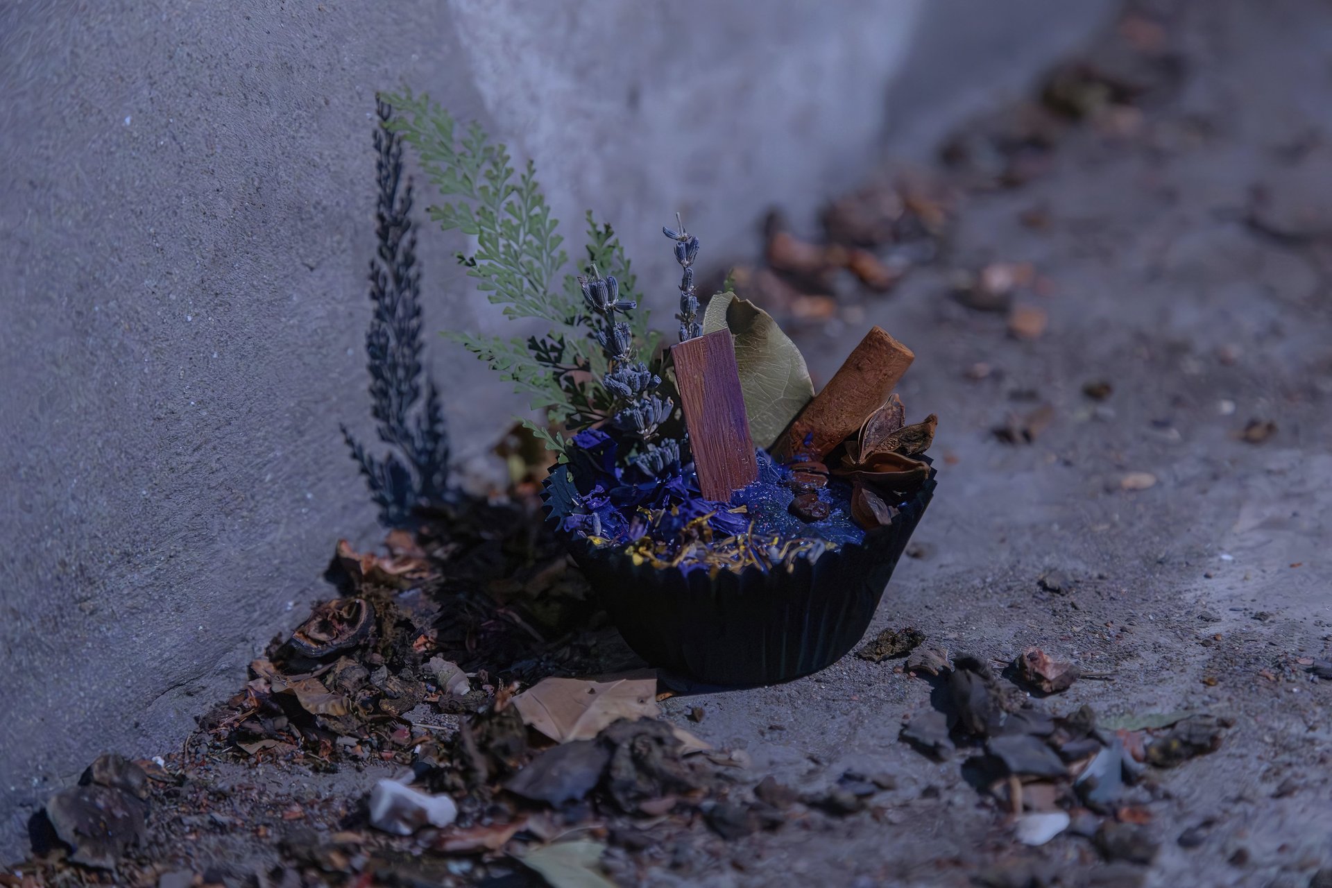
At its core, Ancient Mystic is a collection of ritual-based, handmade wares : candles and botanical infused pieces, oils and tinctures, and tools designed for intention-setting, emotional processing, and personal healing like wands and Ouija boards, mini brooms, and taxidermy art. What Ary creates goes beyond the physical. These pieces are meant to be used, to be worked with - to support moments of reflection, release, grounding, and re-connection. They meet people in real life, not just curated versions of it. There’s a duality in her work that stands out immediately, the balance of shadow and softness. Elements that feel grounded in soil and rites sit alongside something more ethereal, almost otherworldly. It’s not polished in a way that tries to impress but composed in a way that feels honest like a conversation with an old friend or a whisper from a loved one long passed. Like it exists whether you’re looking at it or not. Solid & stable, securing you, evermore.
Aryanna’s role in Ancient Mystic isn’t just an owner or a maker; she is a translator bridging the gap between spirituality and first-hand knowledge of direct encounters, creating instruments that don’t require perfection or witchcraft experience to be effective. There’s an understanding woven into the work that healing isn’t linear, that growth can be uncomfortable, and that sometimes the most meaningful shifts happen in the dark, quiet spaces people don’t always talk about.
Photographing for Ancient Mystic meant leaning into that atmosphere instead of refining it away or changing it to meet some stereotypical commercial look for “dark goth” or “whimsical quirk”. It meant tapping into the essence of spirituality that we sometimes avoid because it’s more comfortable to sit on the outside than look inward or upward. It was shadow work and releasing things no longer meant for me or us in that moment and embracing the look and feel of her design. Our session turned into its own form of spell-casting : Letting shadows stay, letting the bugs sing and birds fly, letting texture speak and the planets revolve. We allowed the details to feel a little too raw, a little too imperfect, a little too alive. The goal wasn’t to clean it up this time but instead to sit with it and honor it, to create imagery that feels like an extension of the brand itself rather than a translation into something more clinical, more common, and more commercial in an over saturated field. What Ary has built doesn’t need to be softened or simplified to be understood. It’s meant to be used or practiced as-is : grounded, intuitive, & a little bit spellbound. Taking home a piece of her art is like living vicariously through Ary’s vision - beautifully symmetrical and as balanced as the seasons.
“I CARE ABOUT OTHER HUMANS & WANT TO HELP PEOPLE AS MUCH AS I CAN IN MY TIME ON
THIS PLANE OF EXISTENCE.” - ARYANNA, ANCIENT MYSTIC
THIS IS WHERE
I COME IN.
That’s where I come in. This isn’t about standard product placement. It’s about creating imagery that shifts the experience from passive viewing to active connection and from strategy to meaningful conversation starters. Through intentional composition, artistic styling, and ever-evolving use of light and perspective, the goal is simple : to move people. It’s time we step beyond being consumers and start becoming participants in what we choose to bring into our lives. While competition is fierce, we tend to look at the numbers and not at the people. I’m here to help put you in the mindset of your ideal clientele, to walk a mile in their shoes and aid you in getting back to the very basics of business, invention, and innovation. I will sit with you while you pretend you’re the one buying and ask the tough questions that we sometimes forget in this hurried world of eCommerce and consistent trade wars.
When you look at a product, what are you actually responding to? Are you looking to buy it or are you looking for inspiration, for closure, for acceptance, to belong? This is the biodiversity of presence-driven promotional imagery.
EVERY PRODUCT IS A MIRROR; WE AS BEINGS DON’T CHOOSE THINGS,
WE CHOOSE THE MEANING WE’RE DESPERATE TO SEE IN THEM.
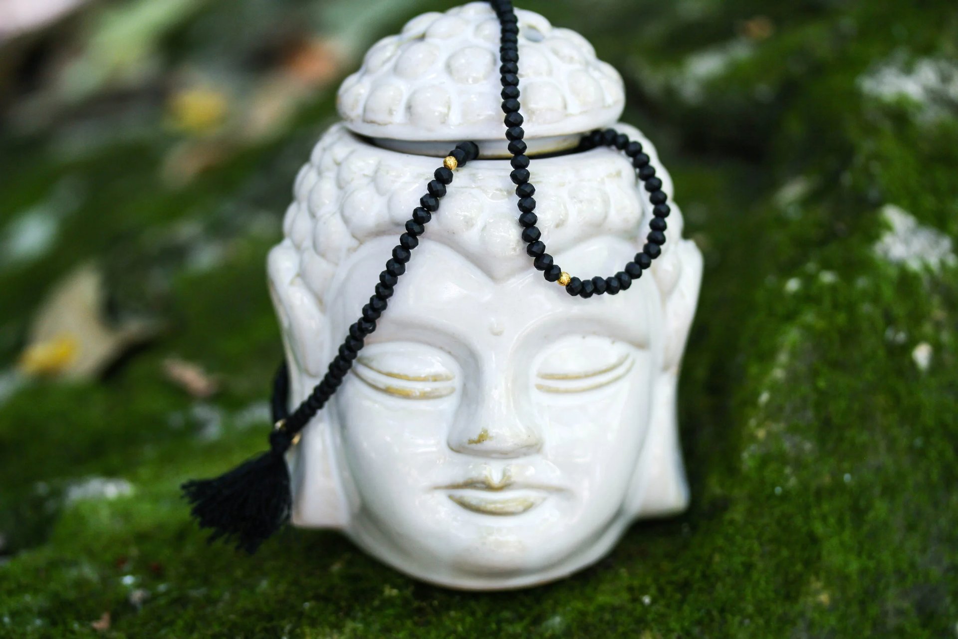
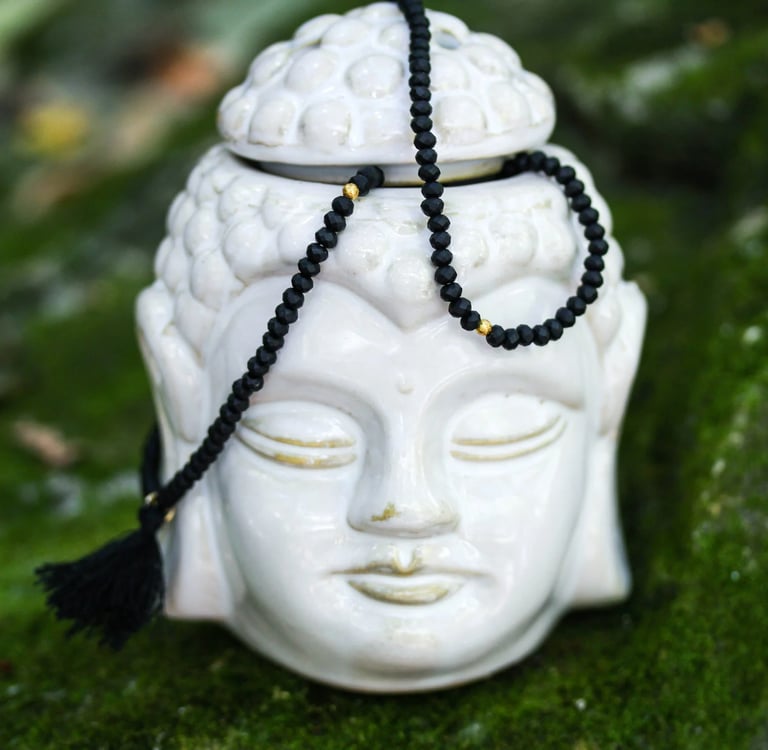
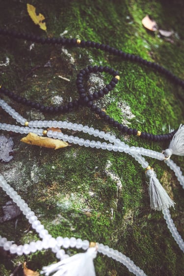
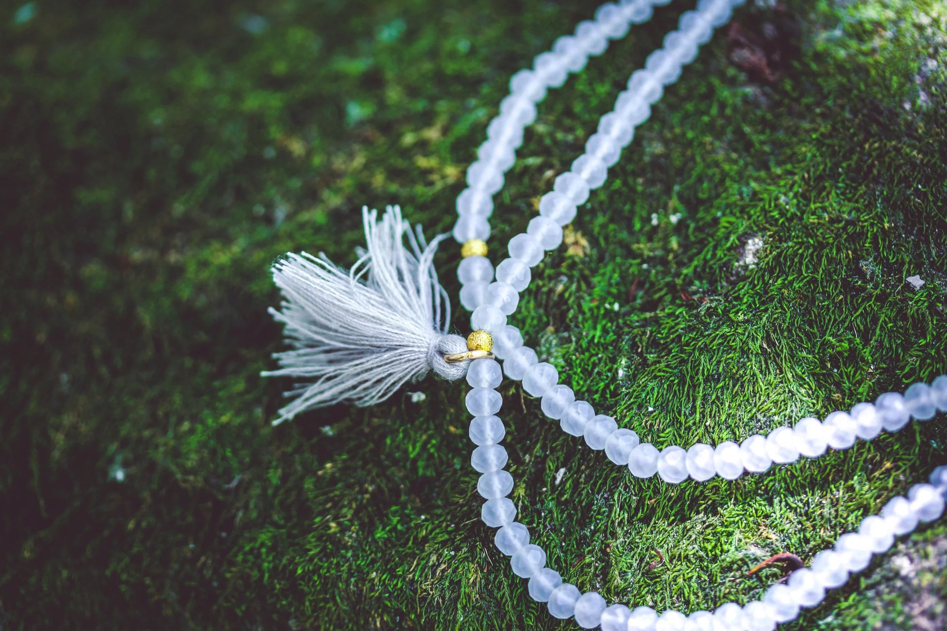
The Japa Life, a brand created by Abby Rhodes, centers around the intricacies and ceremonial use of mala beads. Traditionally, strands of 108 beads are used in meditation to count repetitions of a mantra, prayer, or intention. Each bead becomes a marker, a rhythm, a way to stay present without needing to overthink it or over-analyze it to death. You move one bead at a time, one breath at a time, until the mind settles into something quieter and more focused. Maybe not silent or entirely inaudible but, quieter.
BE STILL BEADS
THE JAPA
LIFE
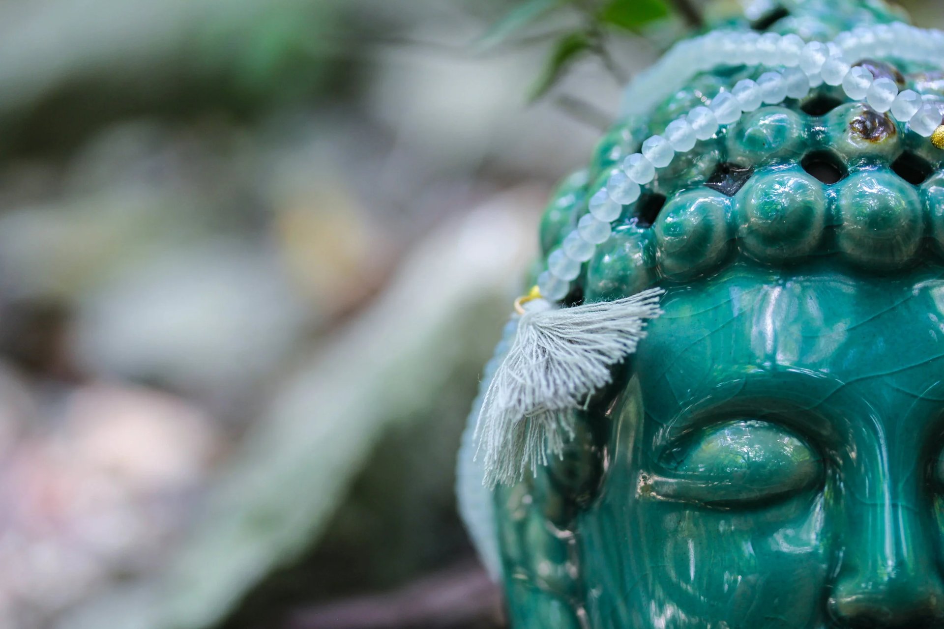
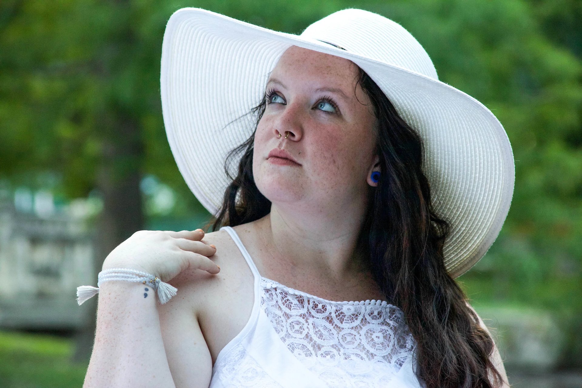
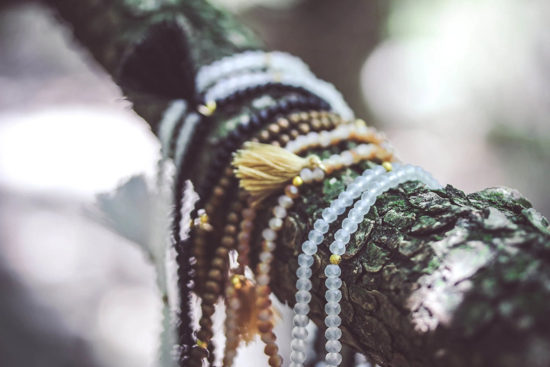
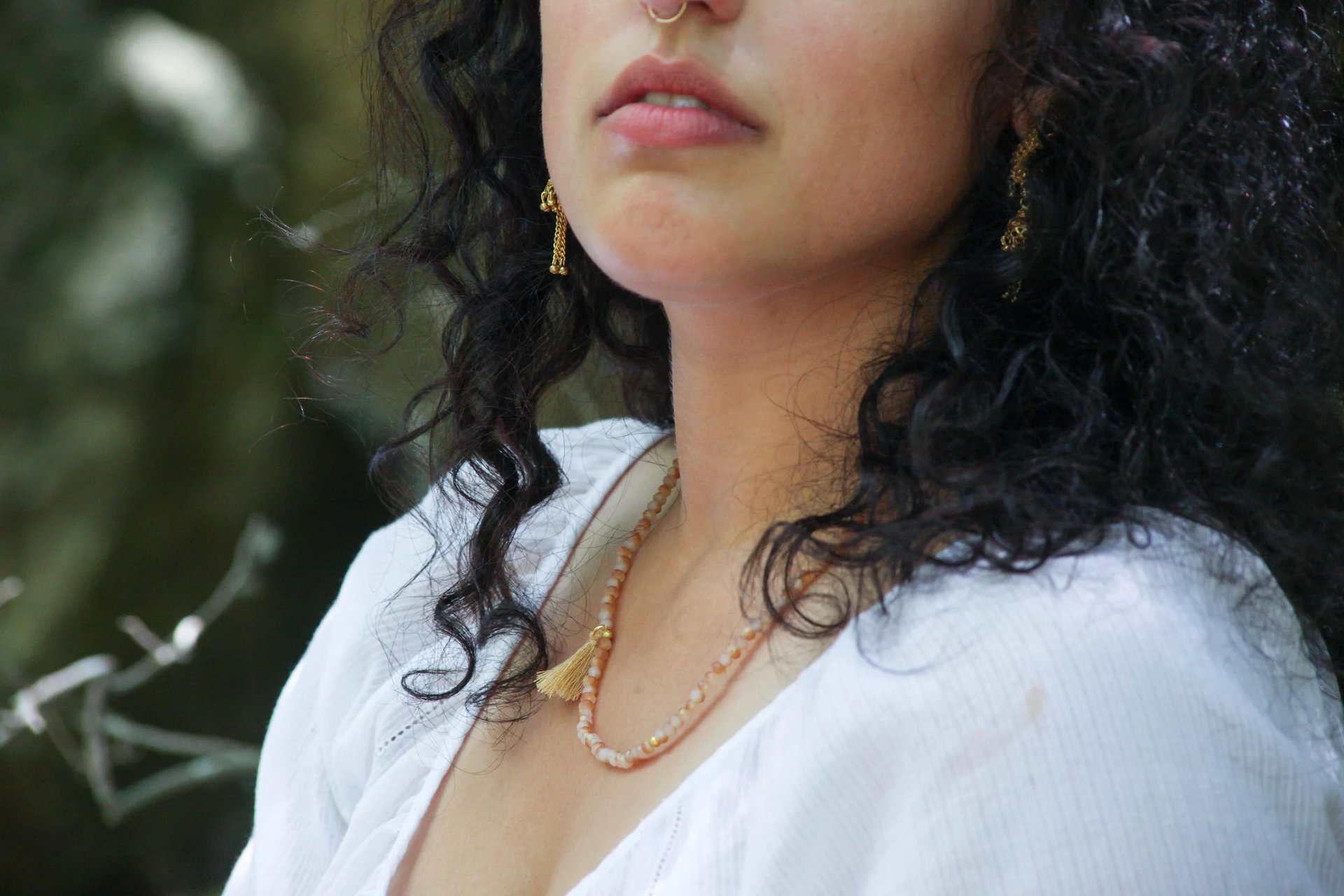
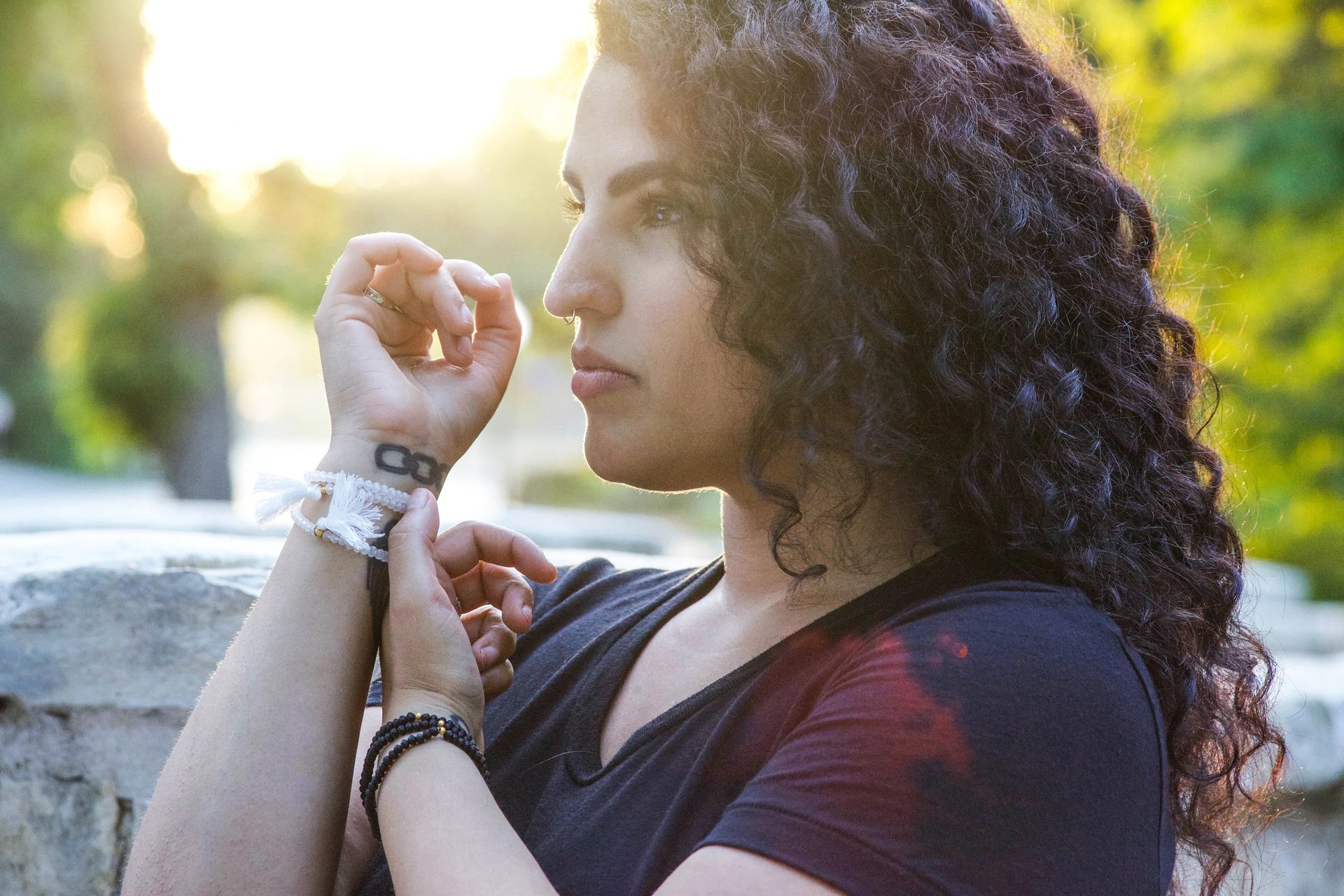
Beyond structure, there’s a layer of personal language built into them. The materials, the stones, the colors - none of it is random. People choose malas based on what they’re working through, what they’re calling in, or what they’re trying to release. Deep blacks and obsidians might represent safety and protection or centering and grounding. Soft greens can lean into healing and heart-centered work within oneself. Blues often connect to interpersonal communication and the journey of seeking truth. Warmer tones like reds, ambers, and golds tend to carry energy tied to youthful and lively vitality, sure but humble confidence, and movement through ambition or the drive to be physically active. When someone selects a mala, they’re not just choosing something to wear : they’re choosing a tool that reflects where they are internally. It becomes personal in a way that isn’t immediately visible to anyone else. Something worn outwardly, but used inwardly.
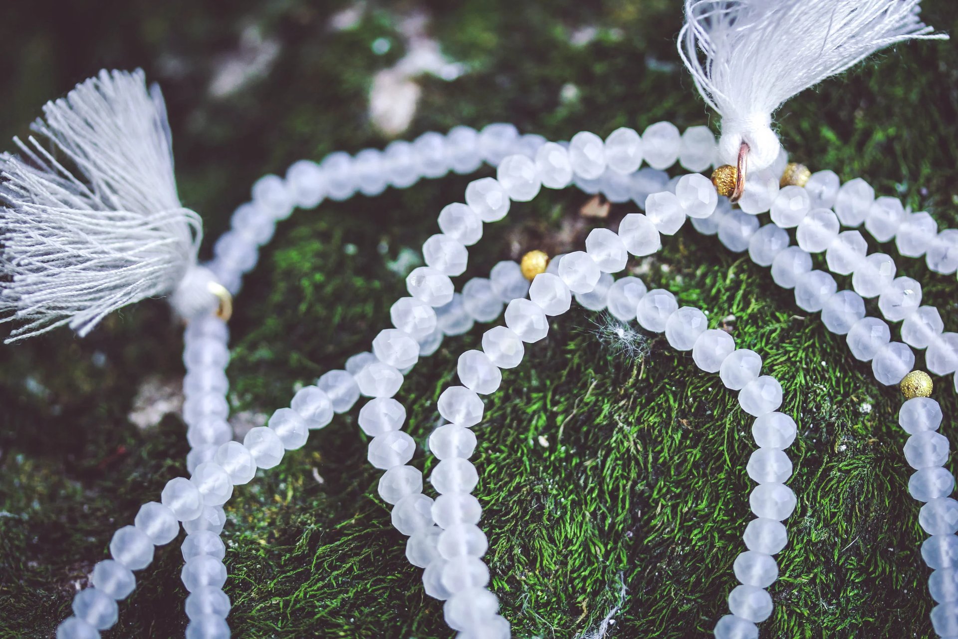
Photographing pieces like this shifts the focus entirely. It’s less about staging and more about observation. How the beads fall, how light interacts with the textiles, how the repetition itself creates visual rhythm. The goal isn’t to make them feel styled but to let them feel held, applied, worn. Because these aren’t static objects. They’re meant to move, to be touched, to be returned to again and again. The Japa Life sits in that space between function and meaning where something simple becomes something deeply individual, depending on who’s holding it.
NOT PRETTY - PRESENT. RITUAL WITHOUT THE PERFORMANCE. ONE BEAD AT A TIME, UNTIL THE NOISE BREAKS.
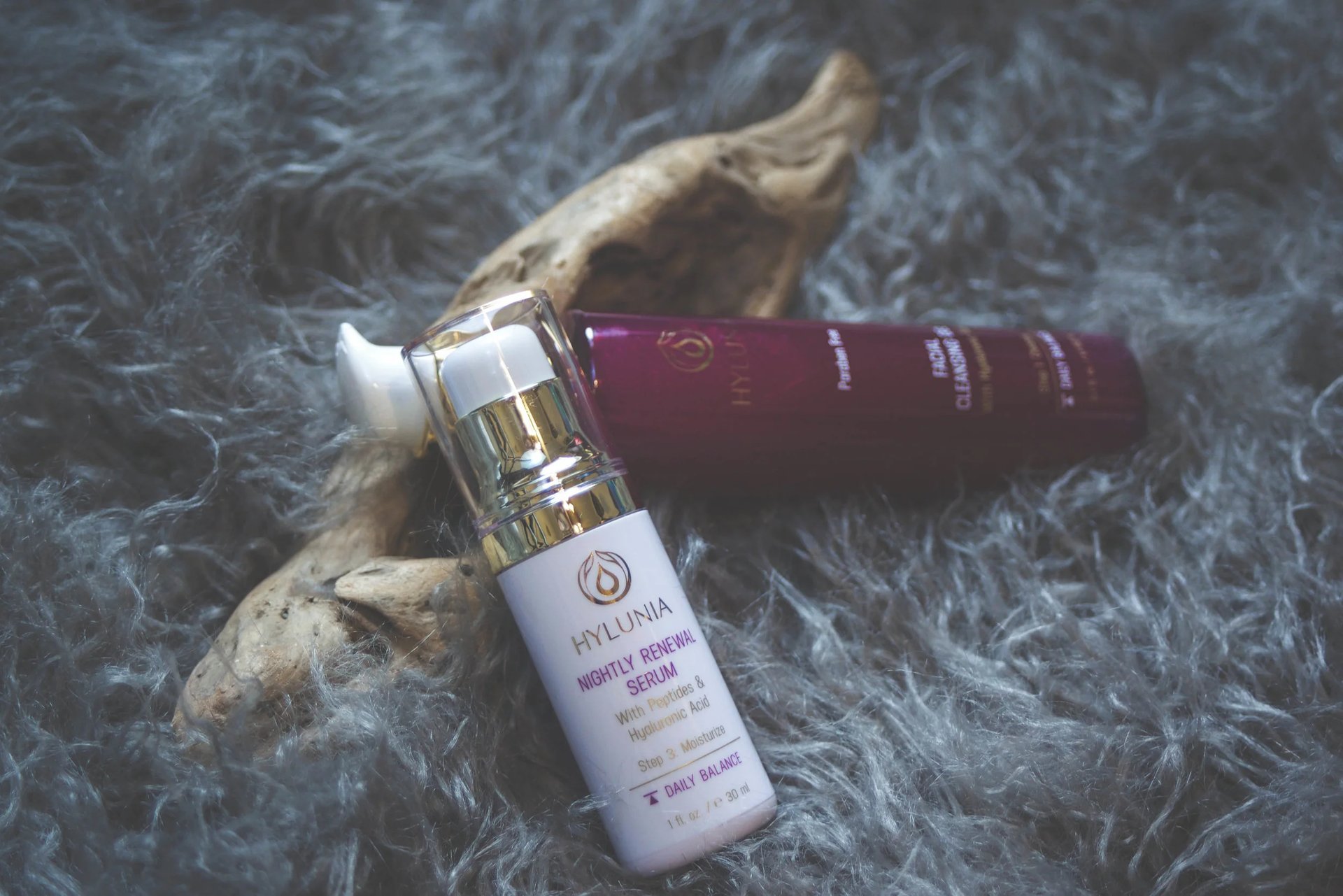
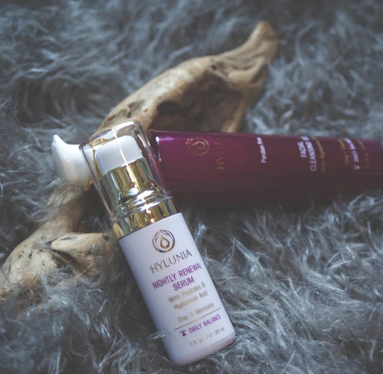
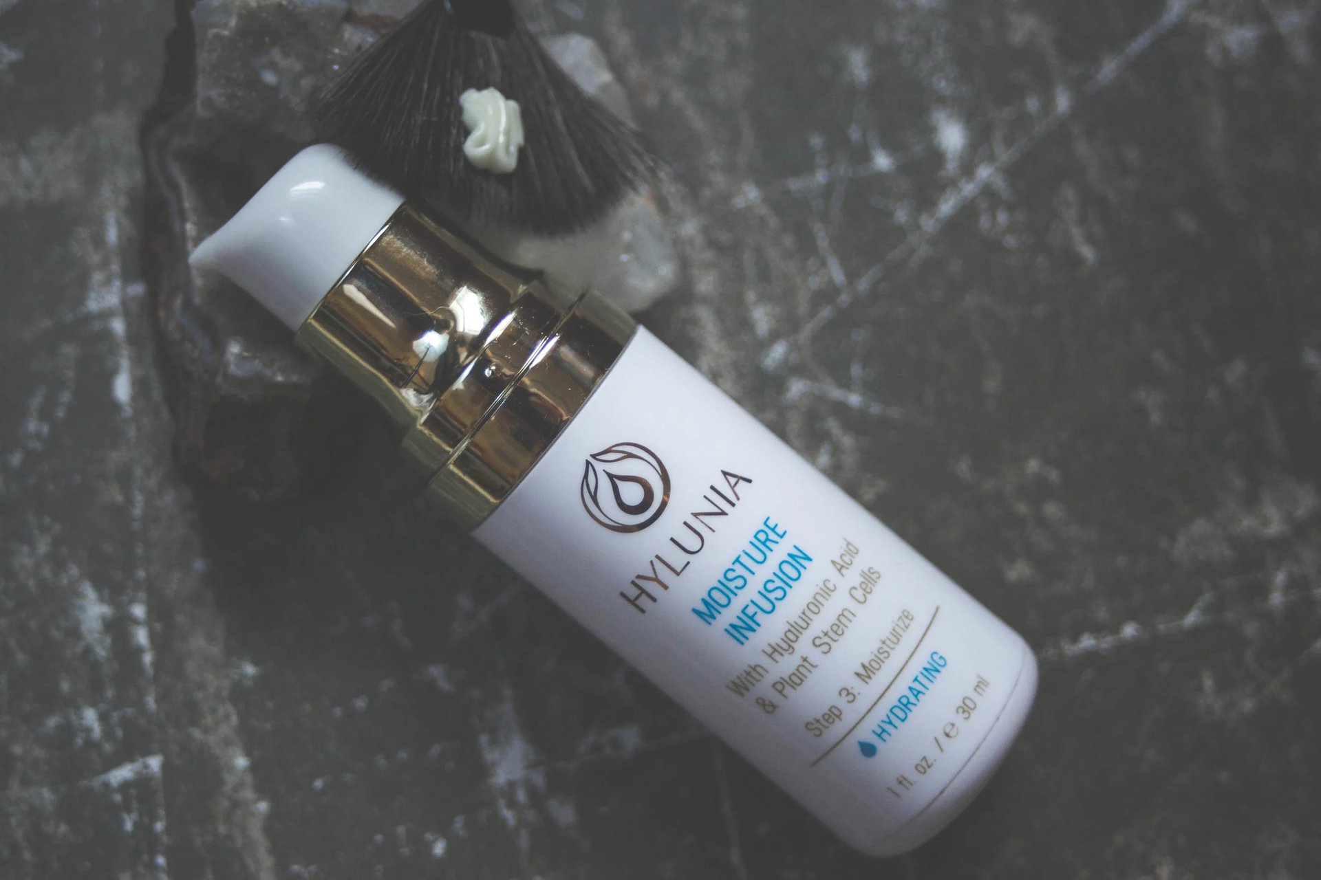
Esthetics studios and beauty brands like Heroine X Hair by Kay (formerly SA Hair, a service of Hair Extensions by Kay) & Embrace Your Face don’t just transform how you look. They change how you see yourself. Brands like Hylunia bring a renewed sense of intention to style and skin health, creating experiences that go far beyond re-surfacing with an exfoliant or some hyaluronic acid. Across the state, hair and make-up artists alike have trusted me to translate their artistry into something that holds its own. It’s an enhancement that lingers and makes you feel good, secure in your skin, even special.
ESTHETIC EXPRESSIONS
CURATE
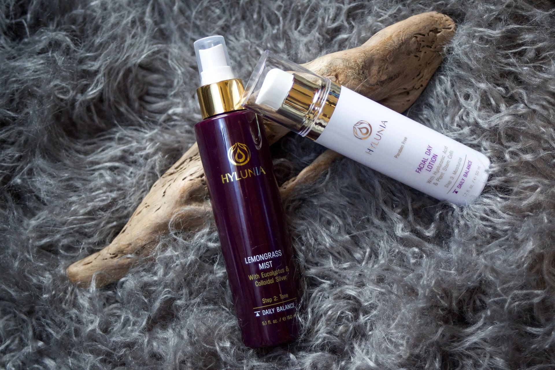
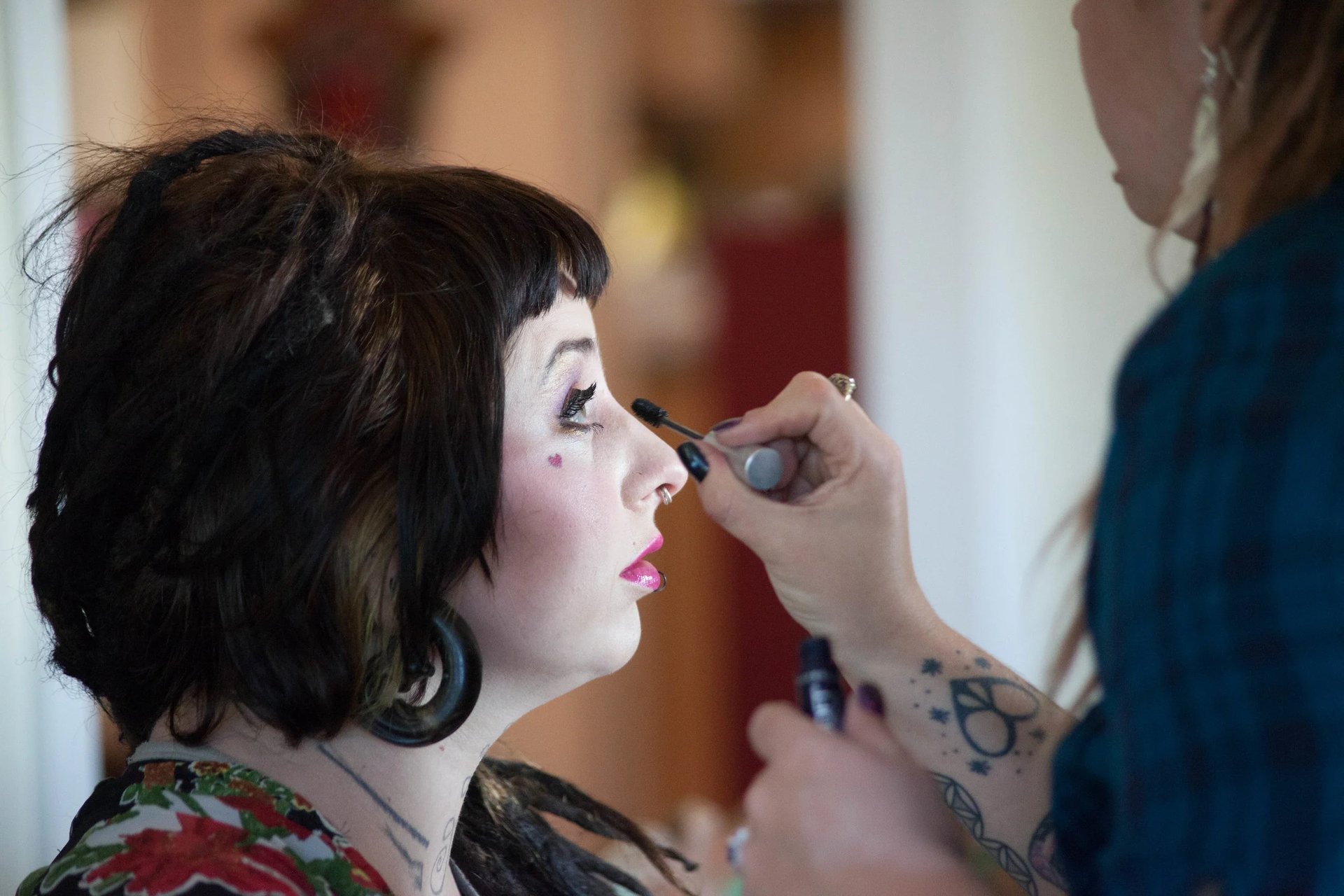

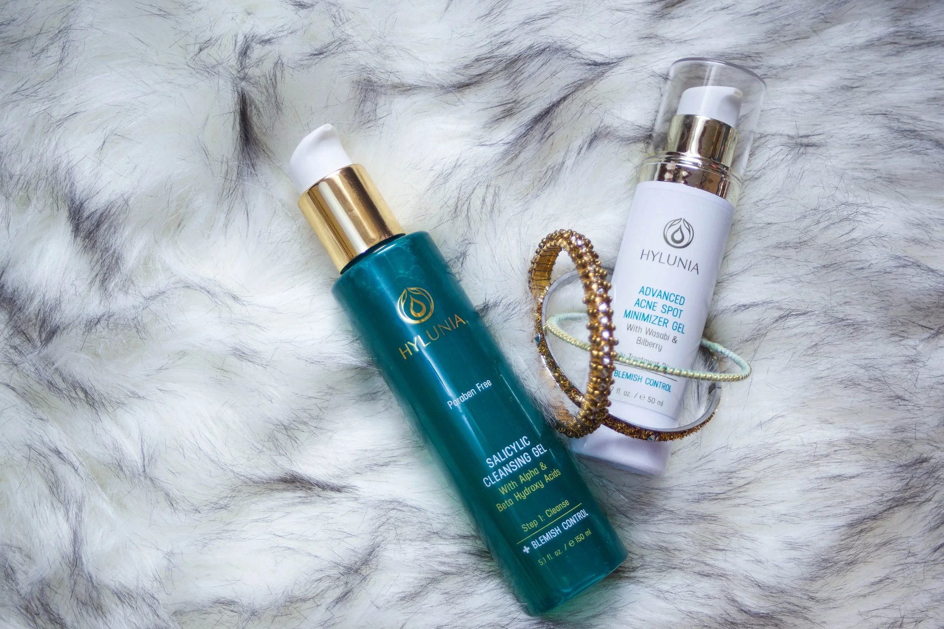
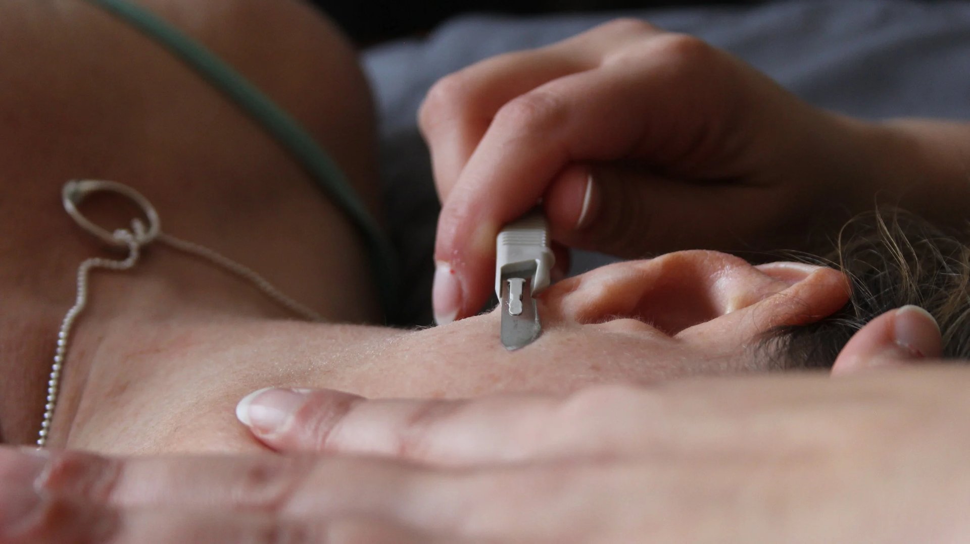
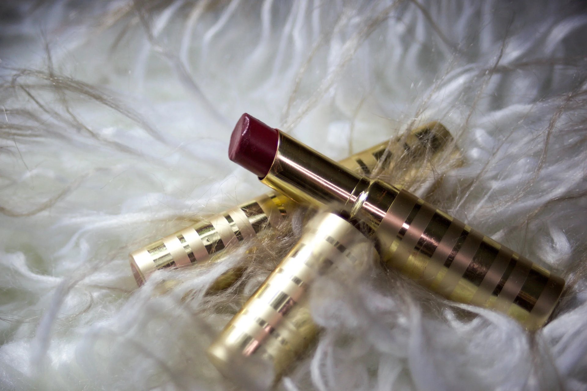
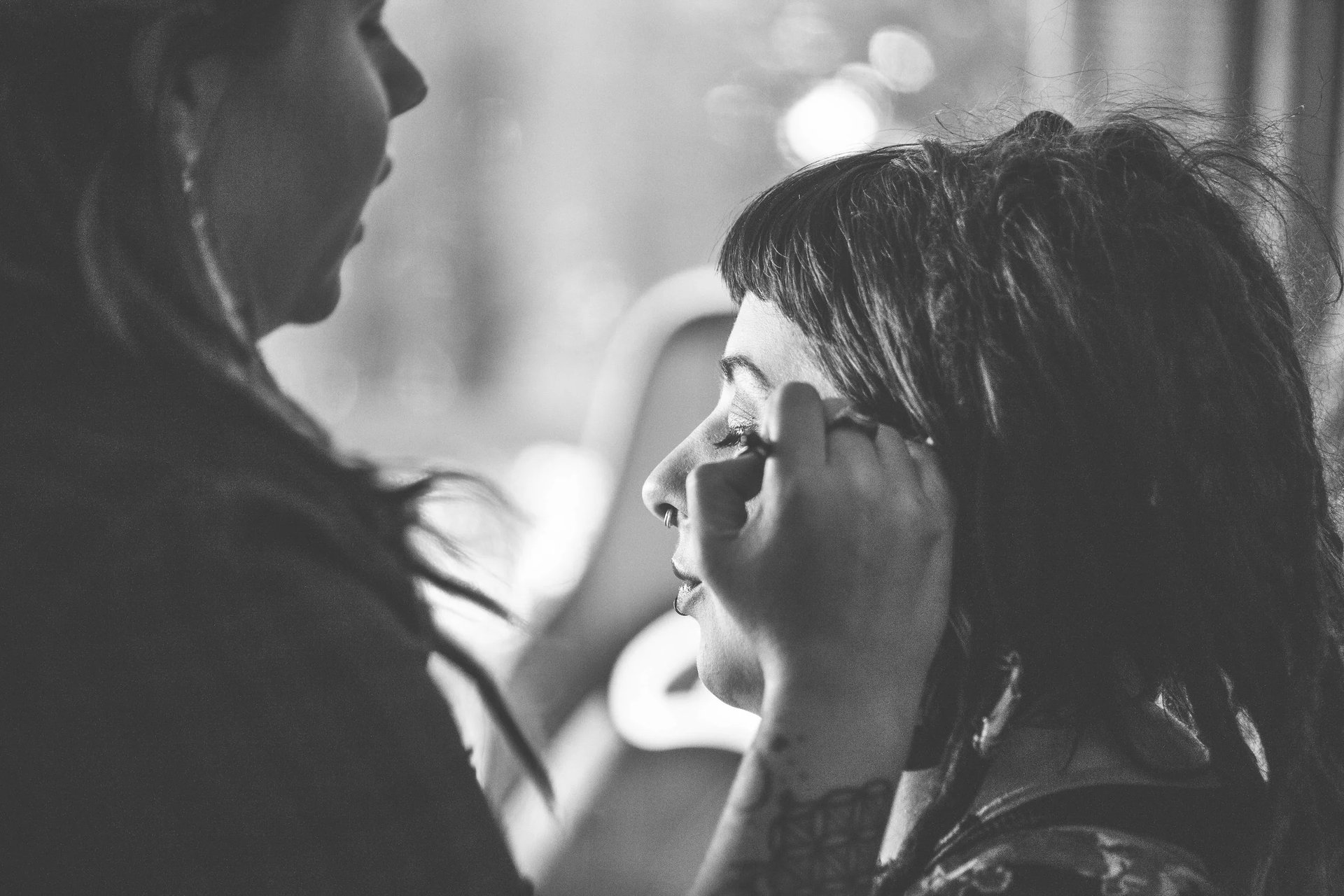
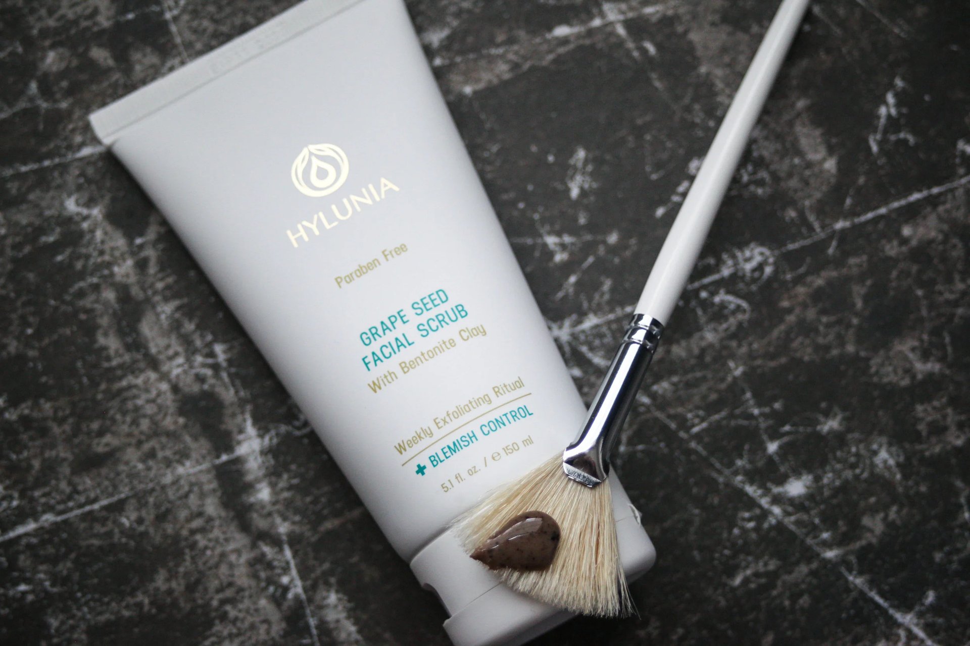
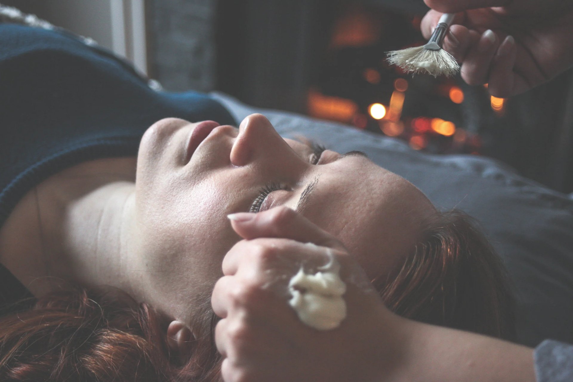
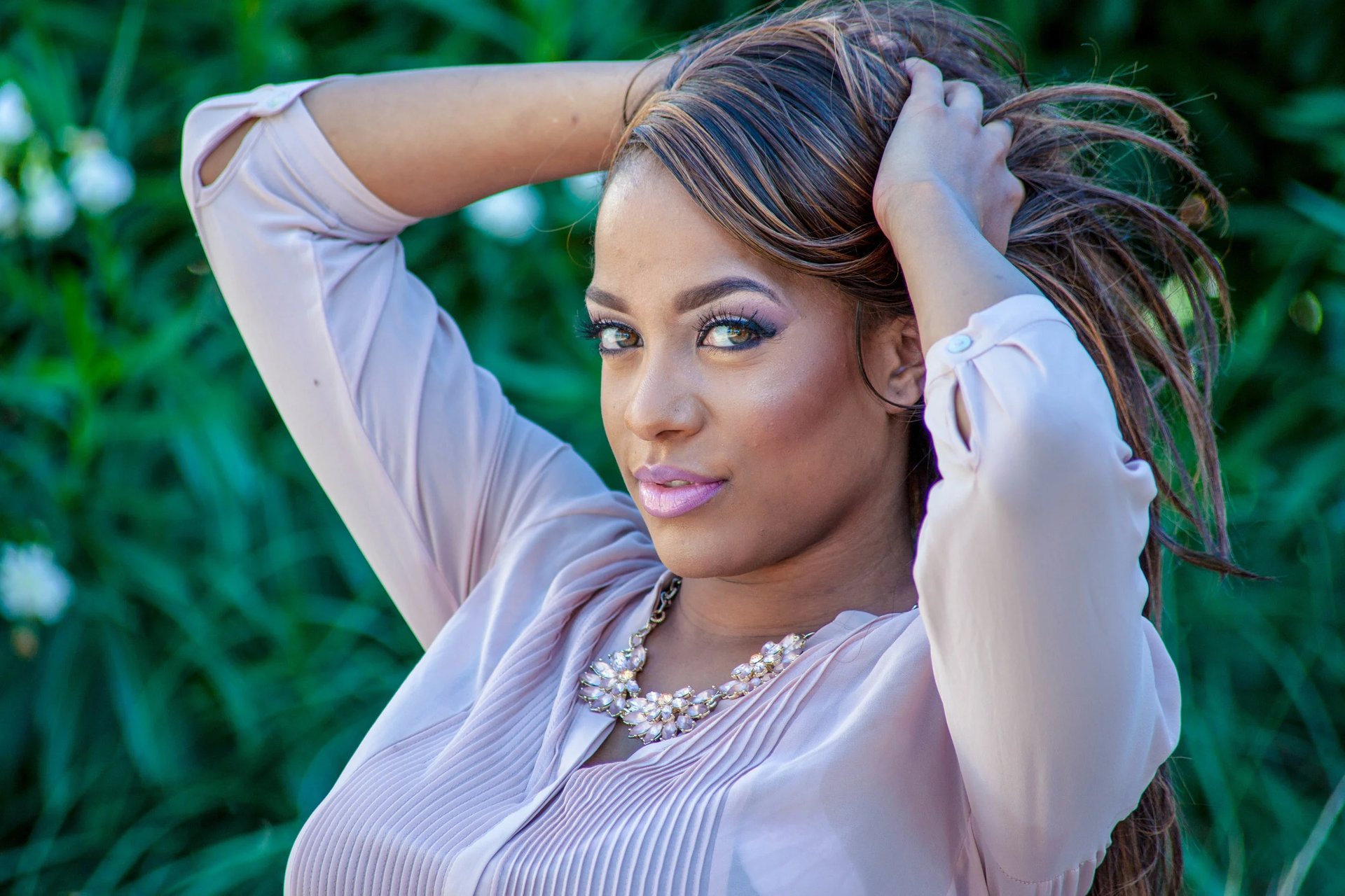
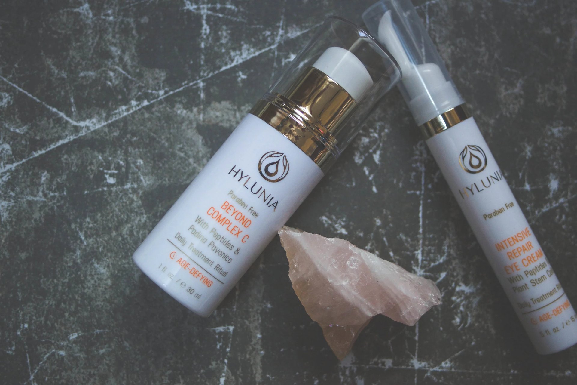
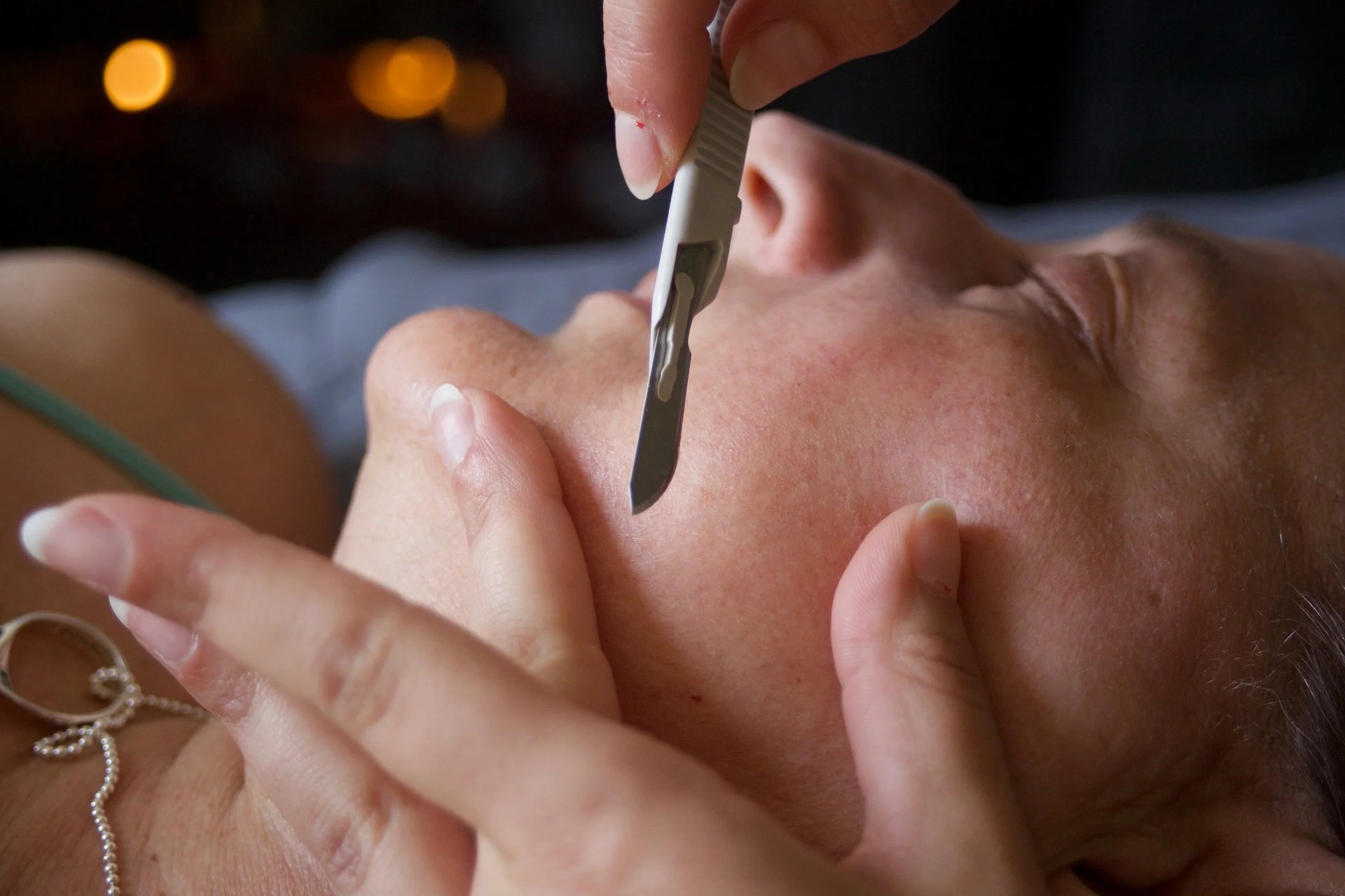
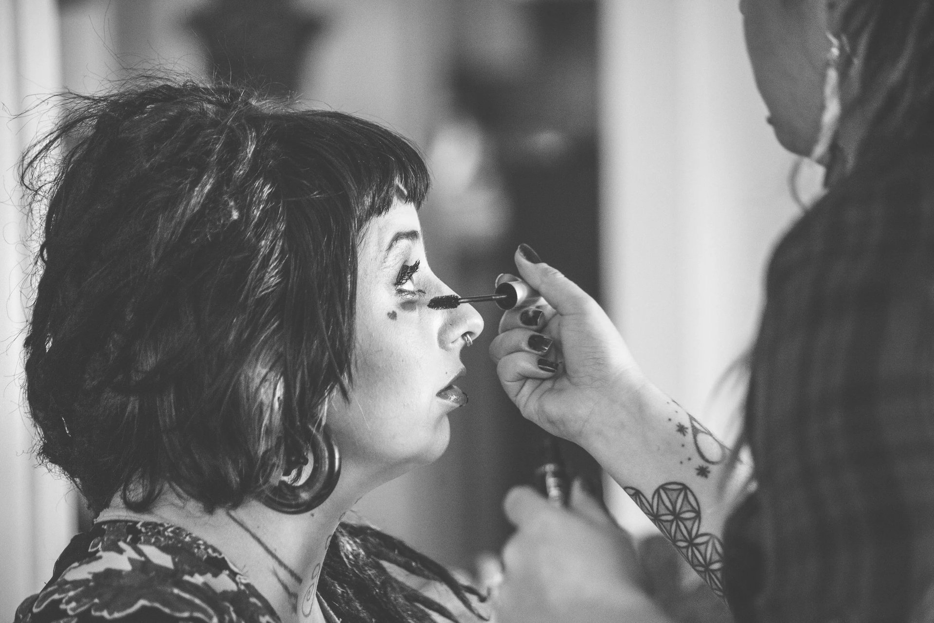
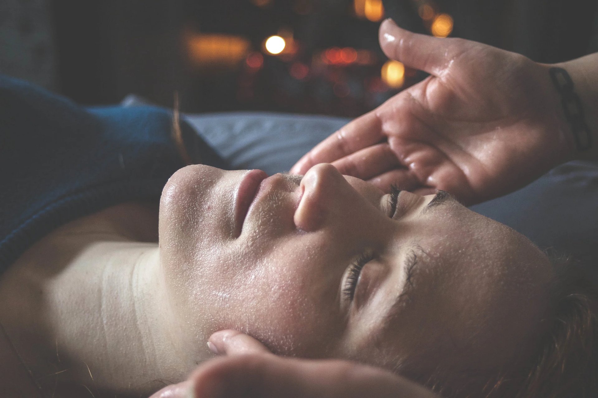
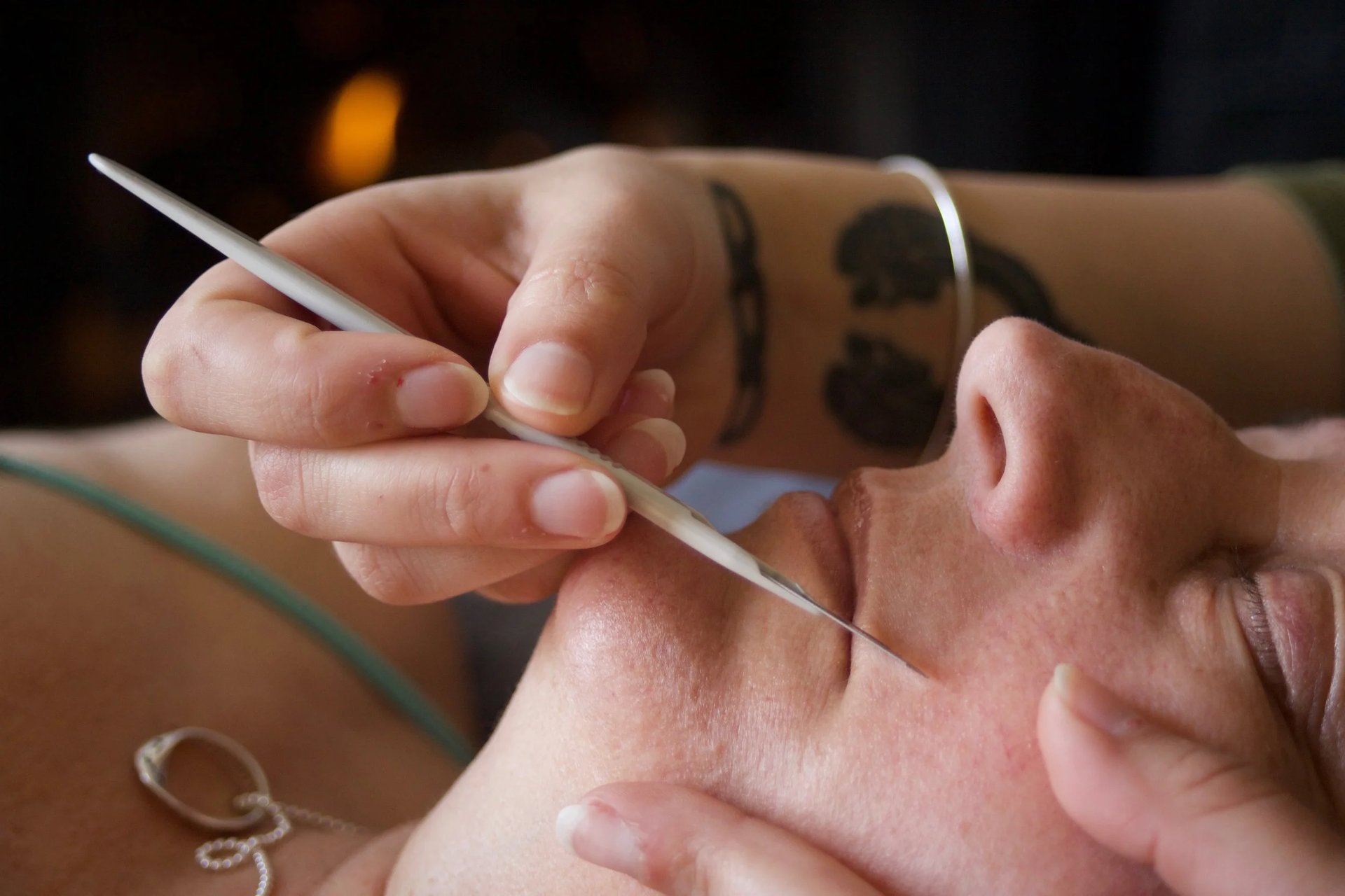
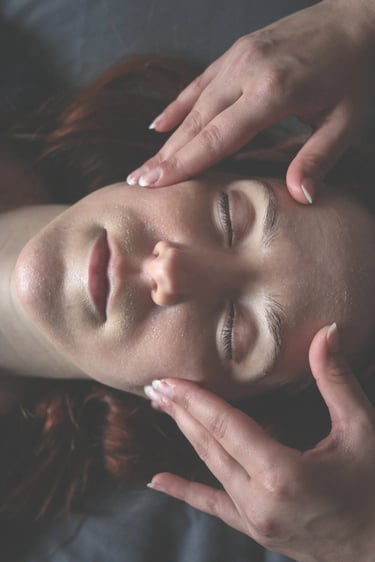
In a space where product placement is often expected to be clean, clinical, and perfectly polished, I like to push it just a little further. To give it weight. To give it personality. To let it breathe. Instead of isolating a product or a finished look, I build a moment around it - something that feels lived in, touched, real. The brush mid-motion. The glow before it’s perfected. The in-between where the magic actually happens. For estheticians, hair and make-up artists, and skincare specialists, the work isn’t just in the final reveal but in the process, the intention, the way a product interacts with skin, texture, light. It’s in the start to finish journey of embracing the skin you are in and finding enhancements that feel like embellishments and not distractions from something that might not be conventionally pretty - it’s almost ritual. I photograph that too. I layer in depth, subtle movement, unexpected angles, and lighting that shifts with the mood of the work itself.
The result is imagery that doesn’t just present what you do - it amplifies the humanity of it. It gives your work dimension, pulls people closer, and lets them experience a hint of what it feels like to be in your chair, in your space, in your hands.
CULTIVATE

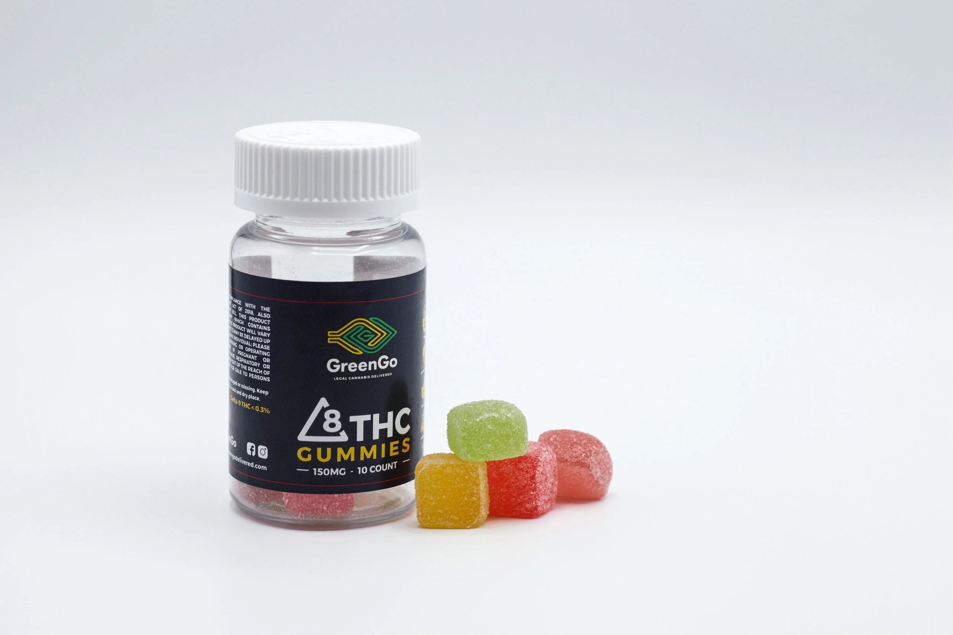
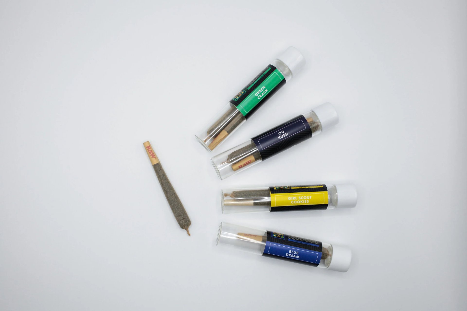
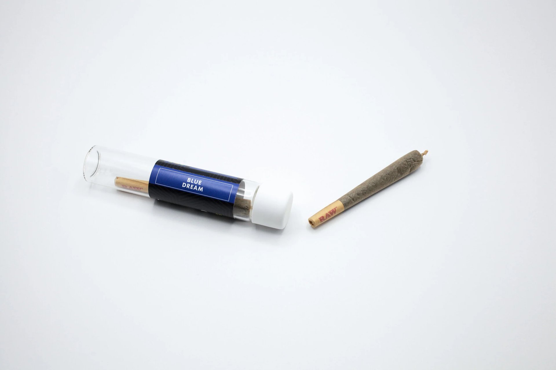
GREEN GO DELIVERED + HERBAN BUD +
ASSORTED HEMP & CANNA-BRANDS
Photographing commercial content for brands like Herban Bud and Green Go Delivered, alongside several other canna companies has been an exercise in precision, conviction, and storytelling within a social and political space that’s ever evolving. Each shoot becomes less about the product alone and more about translating the integrity behind it: the sourcing, the intention, the experience it’s meant to create.
MARY JANE + CO.
Across these collaborations, the work has consistently come back to one thing : the audience. Who is this product meant for? It’s striking that balance between compliance + creativity, where the visuals speak clearly, build brand reliability, and allow each brand’s identity to come through without ever needing to overstate what’s already there.
"WHEN YOU SMOKE THE HERB, IT REVEALS YOU TO YOURSELF." - BOB MARLEY
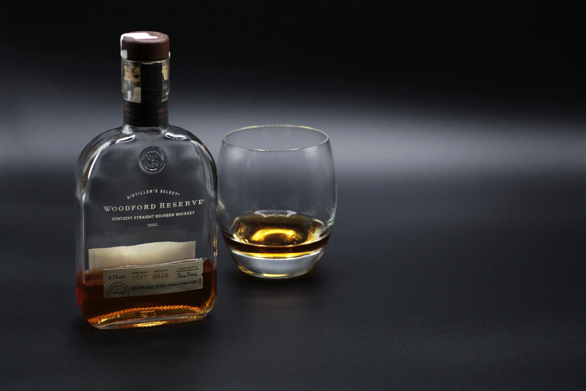
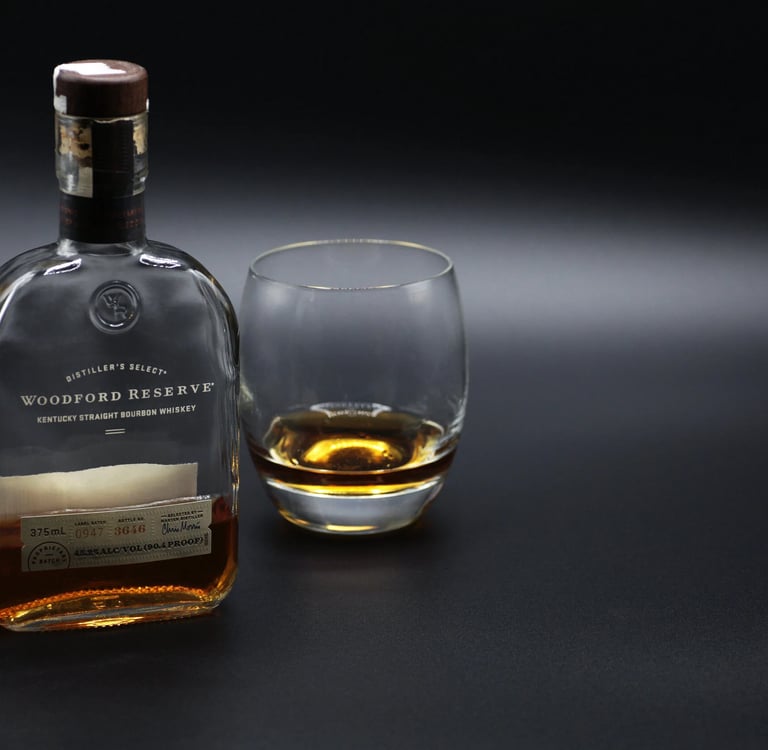
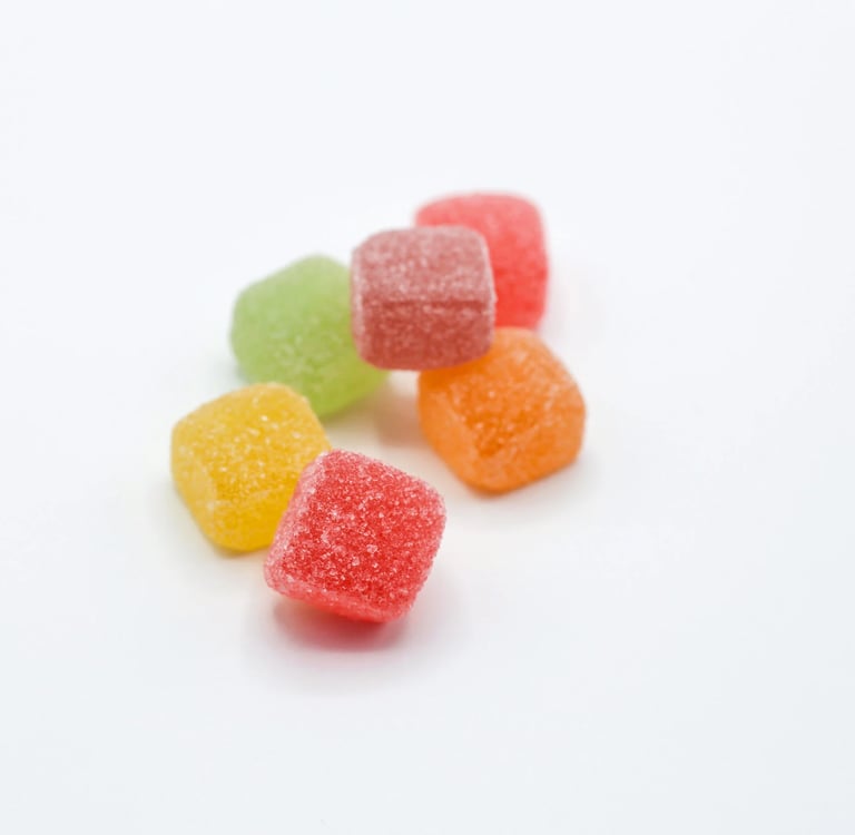
Photographing Delta-8 and other hemp-derived canna products lives at this interesting intersection of science, storytelling, and restraint. These brands sit in a legally nuanced space, which means every image has to carry intention. It has to feel elevated, trustworthy, and comforting without leaning into anything misleading or overstated. Clean compositions, intentional lighting, and thoughtful styling become everything. The goal isn’t to make it look good because this has to feel just right : credible, compliant, and unmistakably aligned with the brand’s holistic voice.
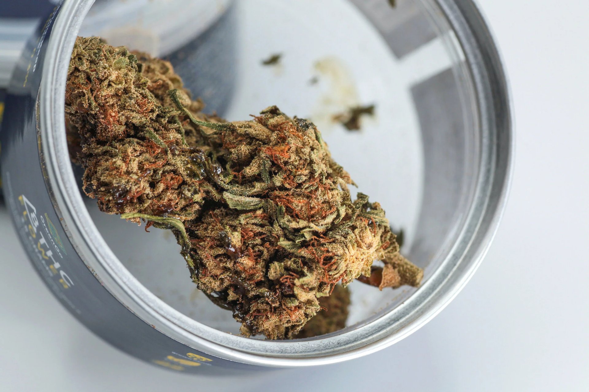
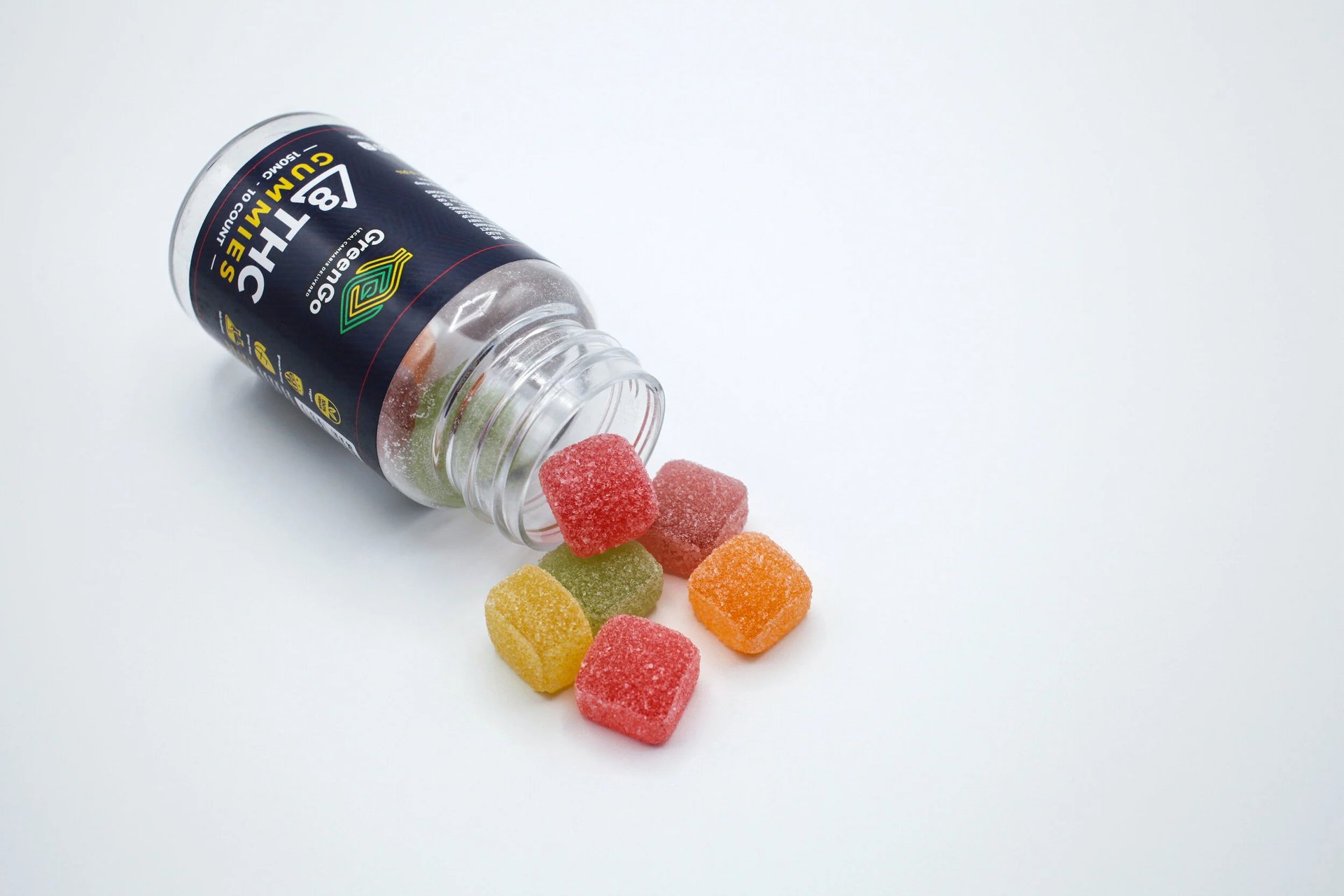
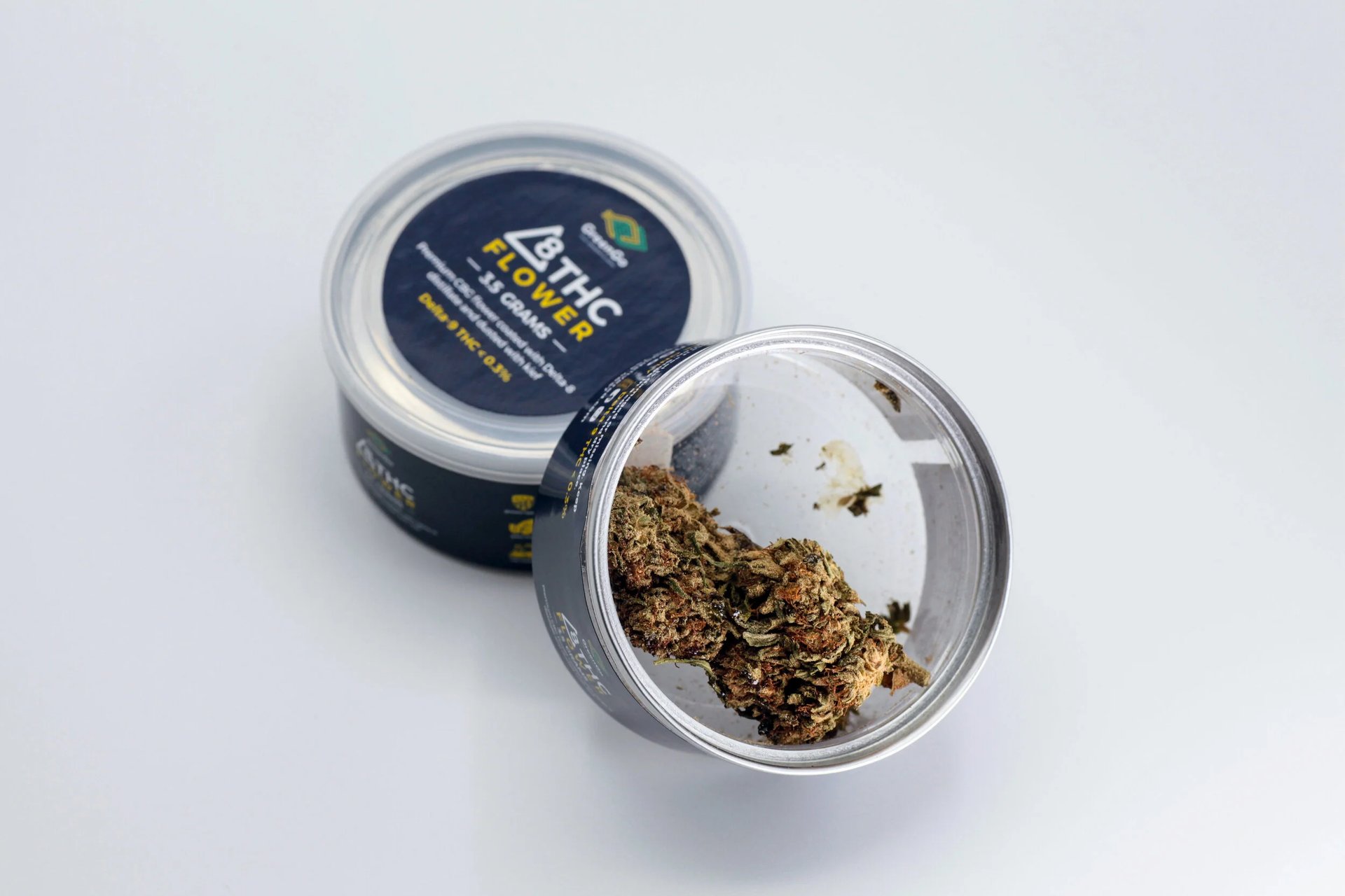
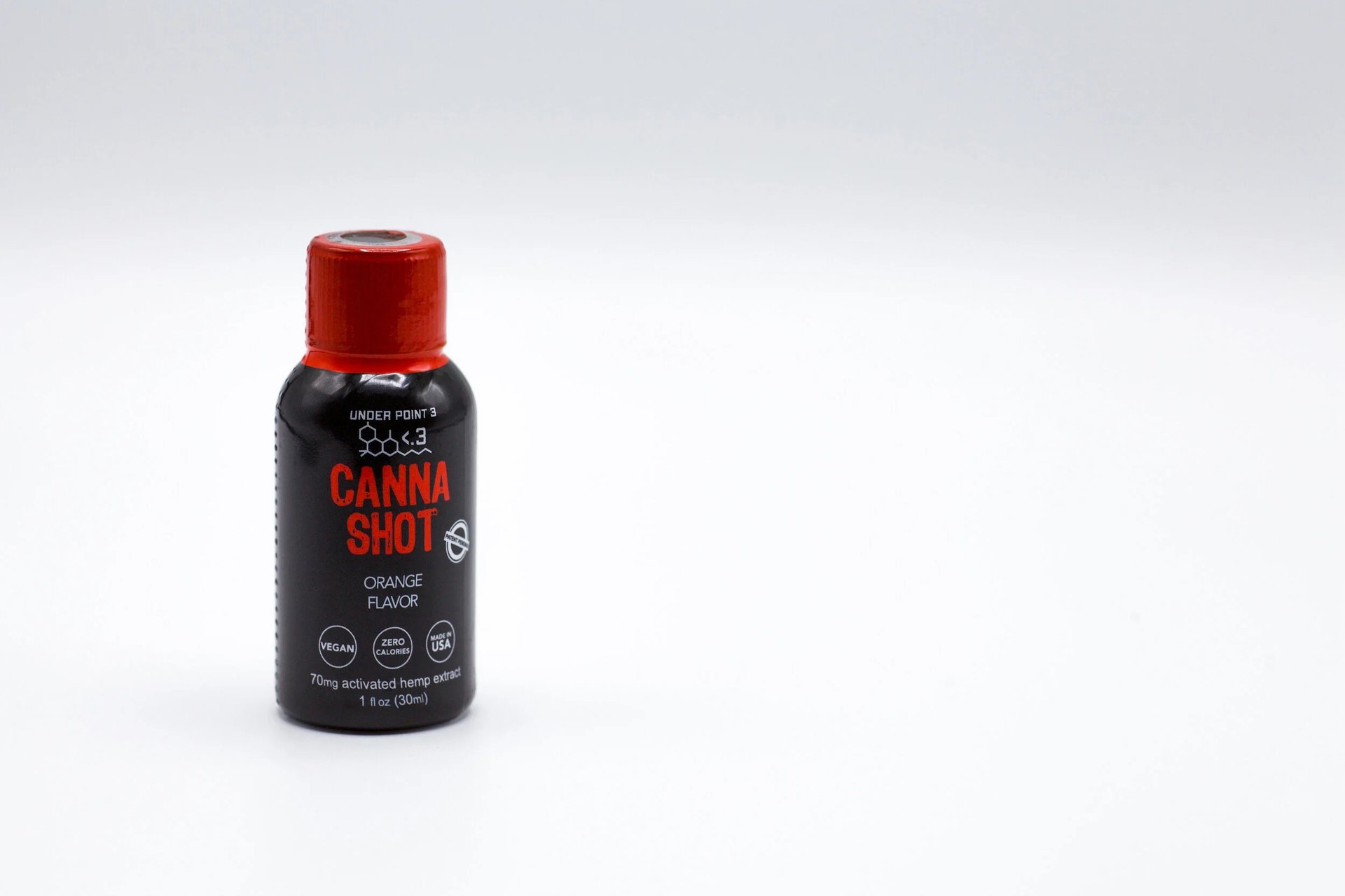
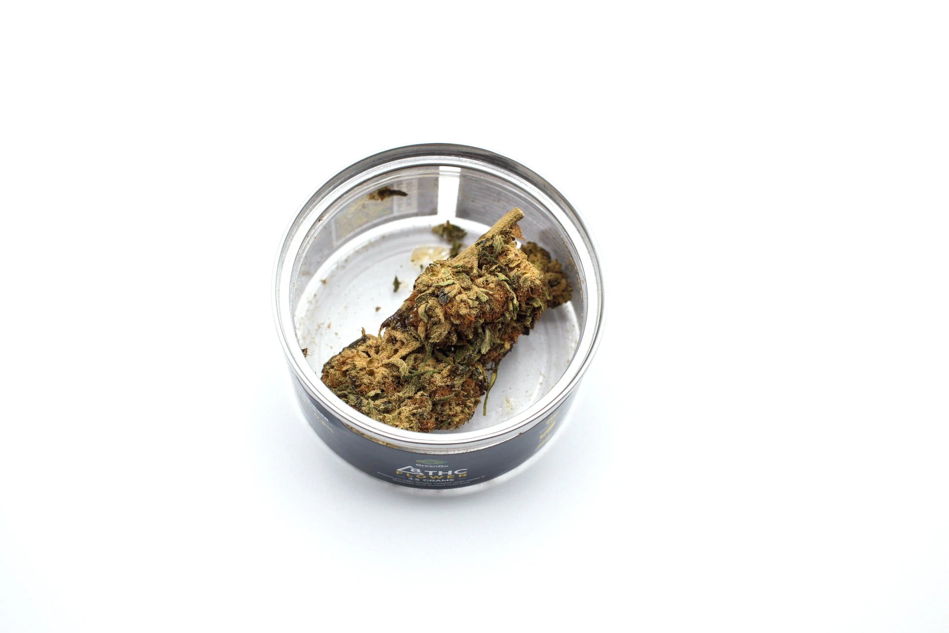
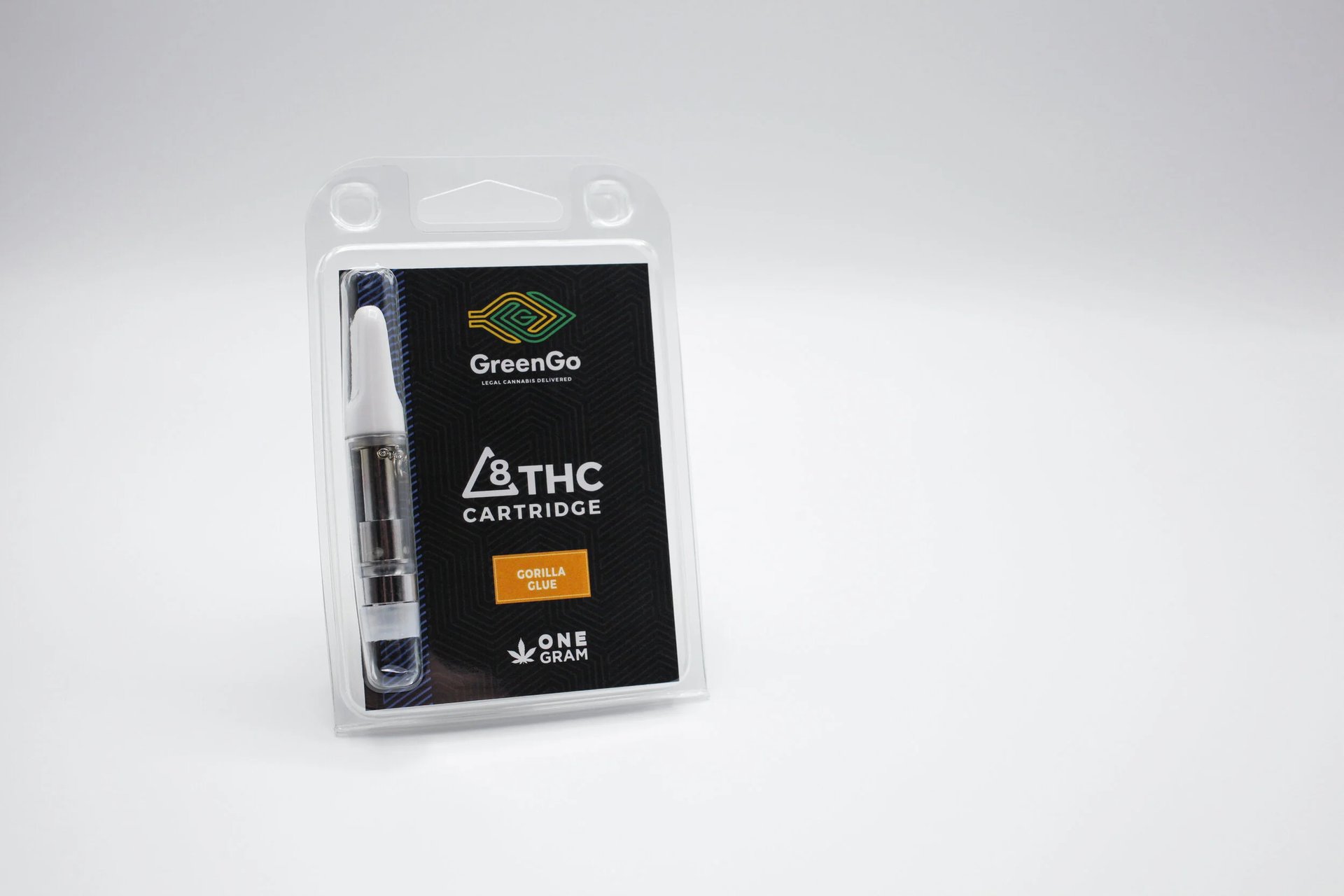
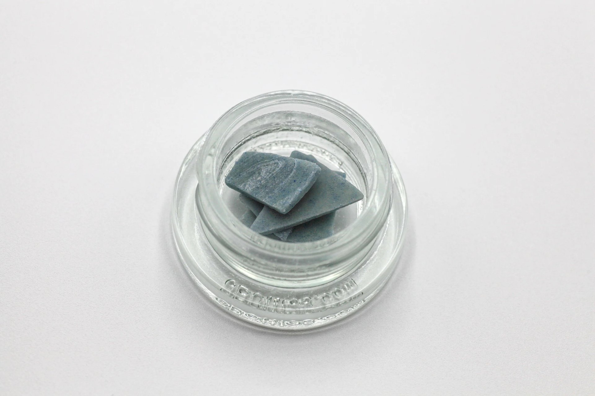
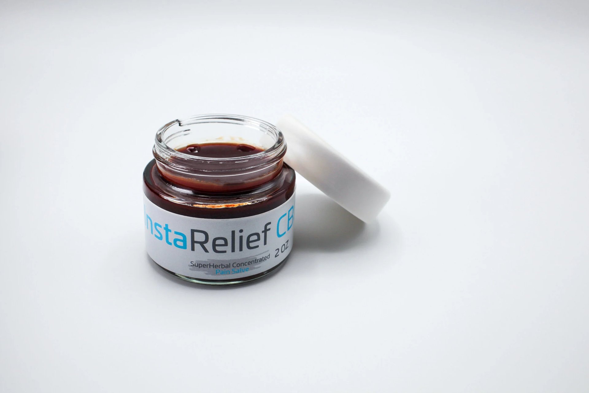
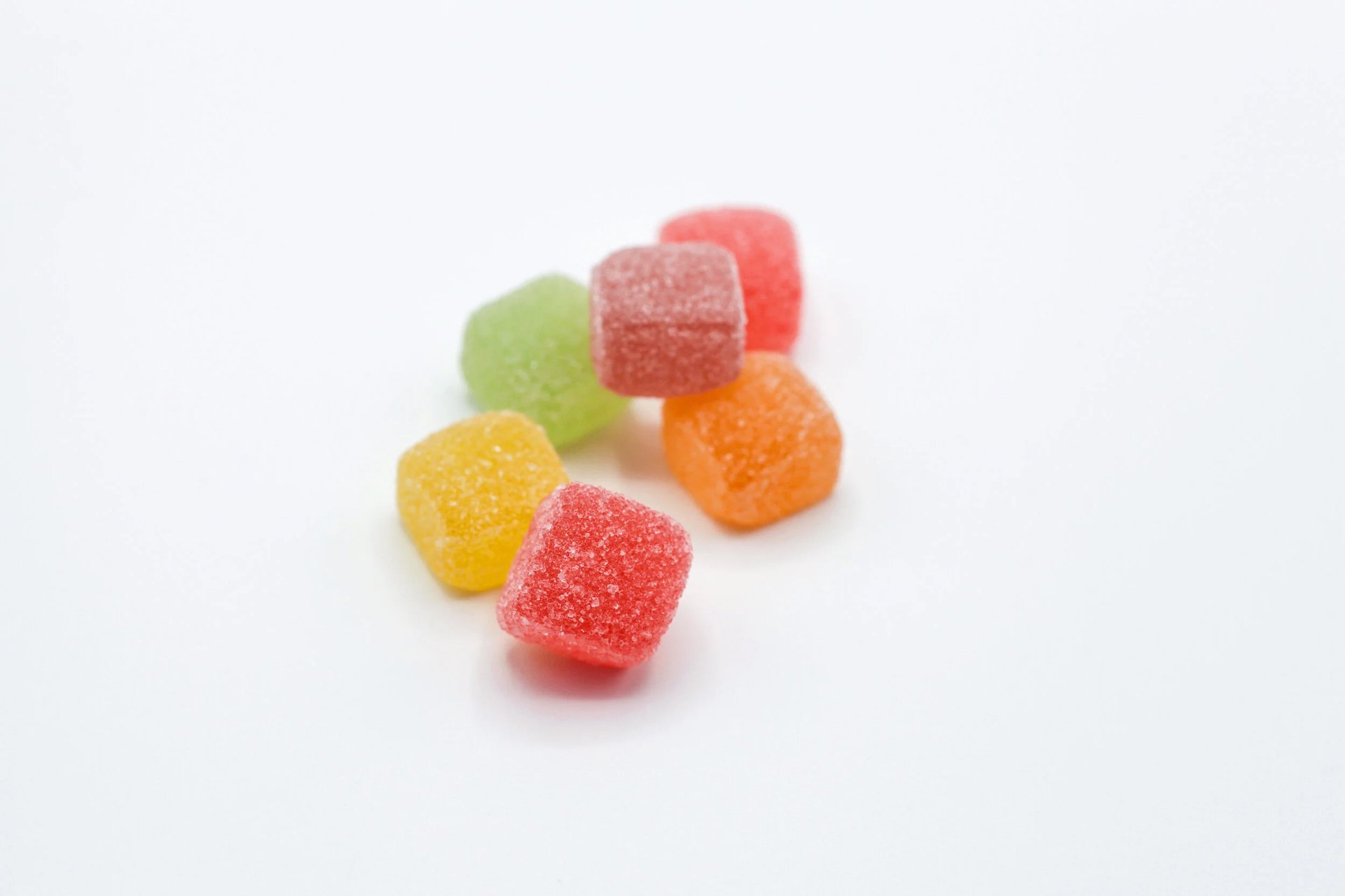
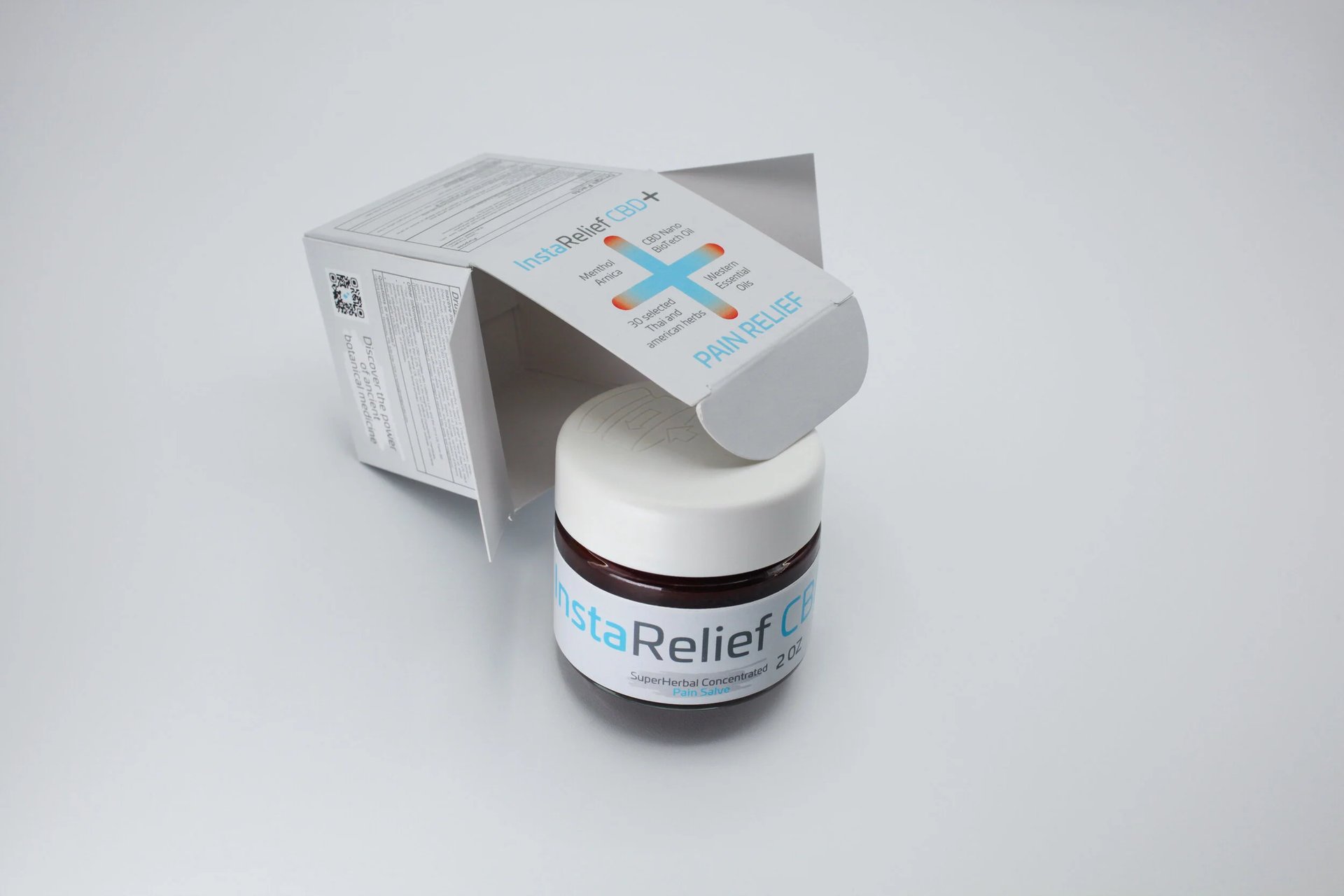
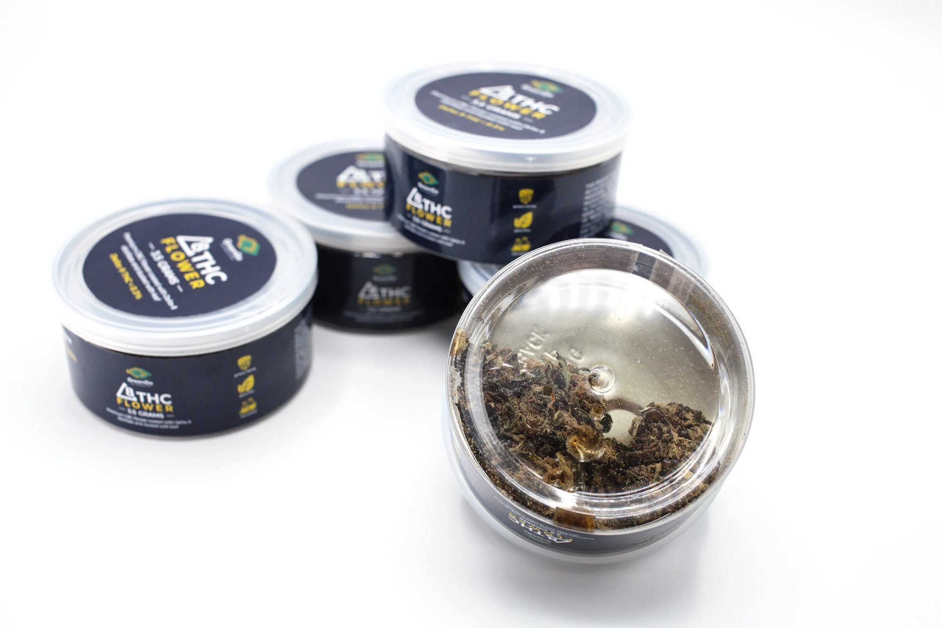
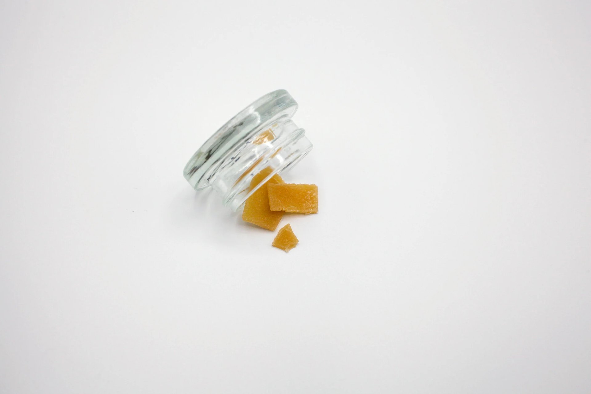
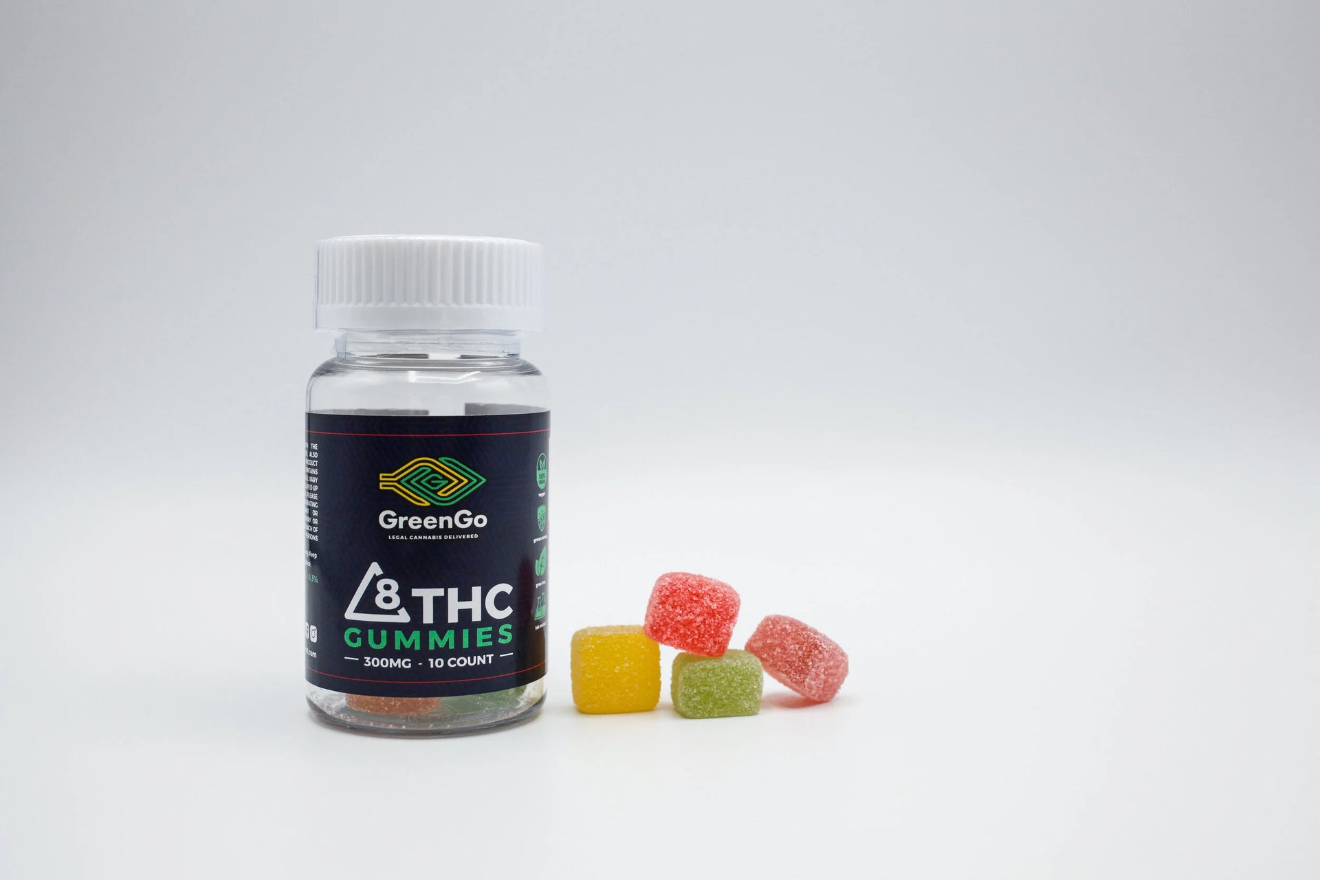
What I’ve found is that the most compelling imagery in this space doesn’t try to shout. It holds reverence for the microdose and the high as two sides of the same coin. It respects the product, the process, and the people it’s meant for. Whether it’s oils, edibles, or topicals, there’s a balance between approachability and professionalism that has to be honored. When you’re promoting wellness, the artistic method becomes about ritual and curiosity without crossing the lines of legality or breaching alternative medicine ethics. When it’s done right, we create something subtle but powerful : imagery that invites people in, builds trust at a glance, and lets the product speak without ever needing to say TRY ME, BUY ME or SPEND YOUR GREEN ON OUR GREEN.